
Design Currents: Color Contrast
Striking color contrasts are energizing interiors in Brooklyn and beyond.

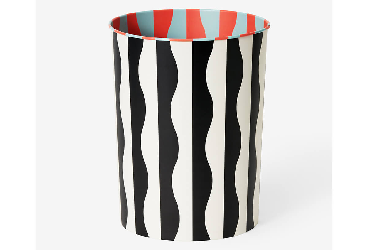
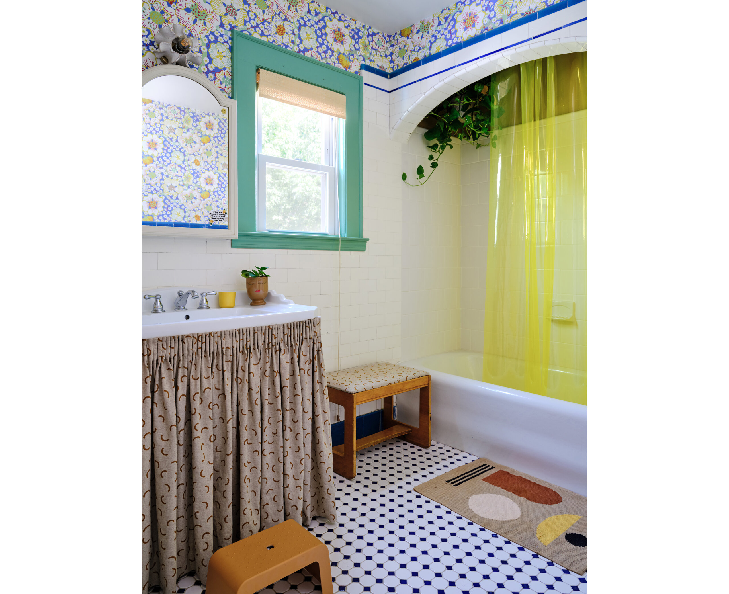
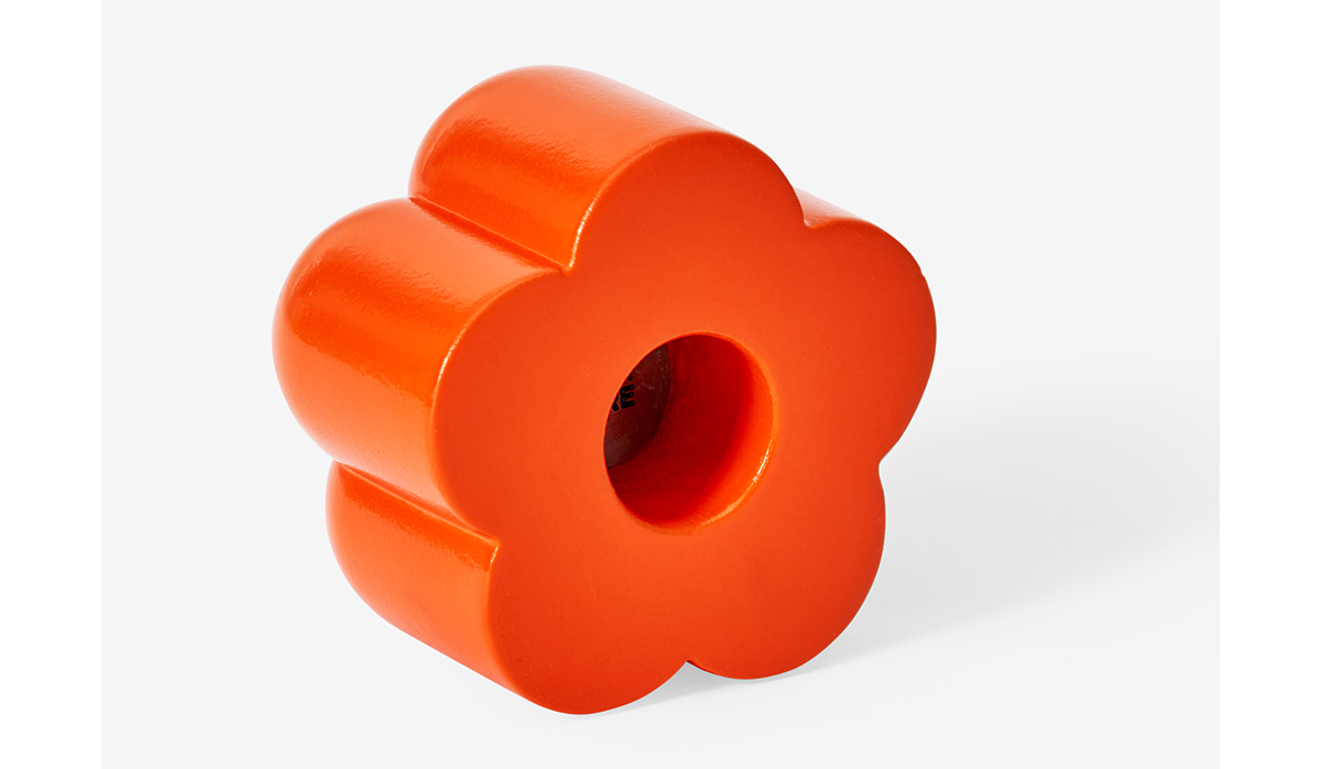
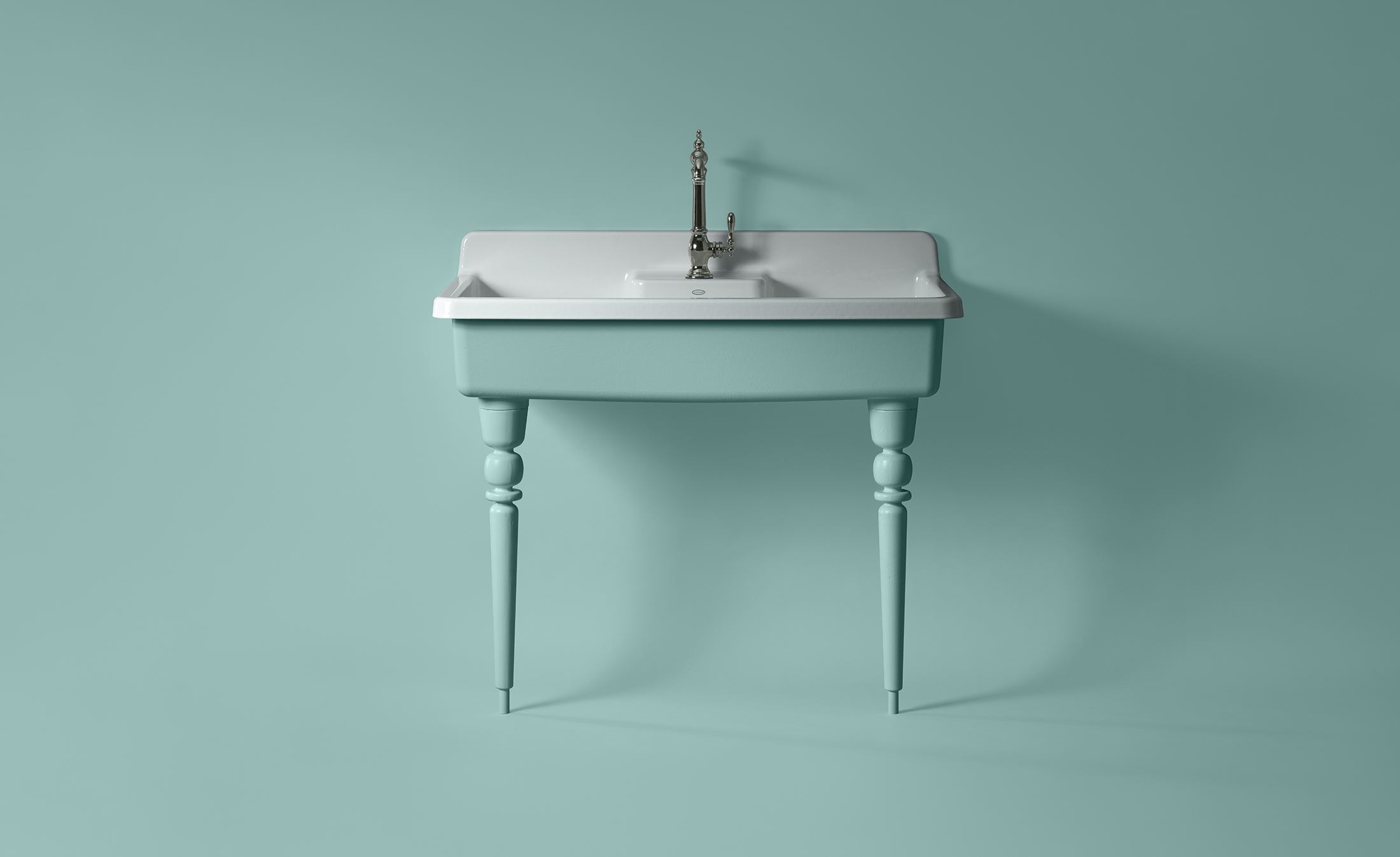
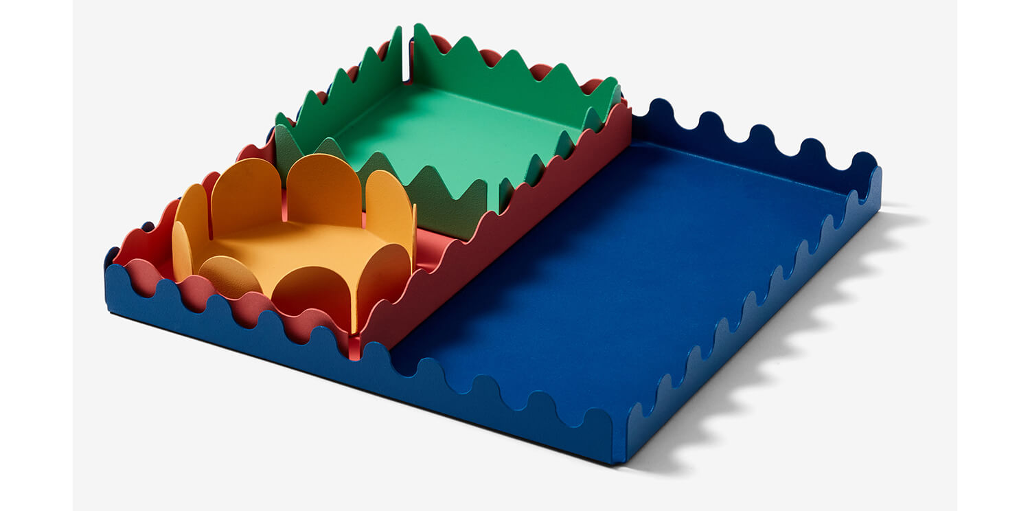
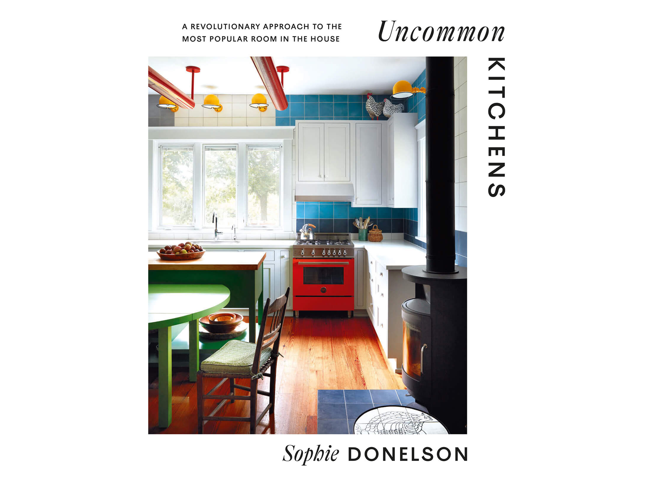
Photos clockwise from left: Madeline Tolle for Hollie Velten, Areaware, Areaware, and Abrams
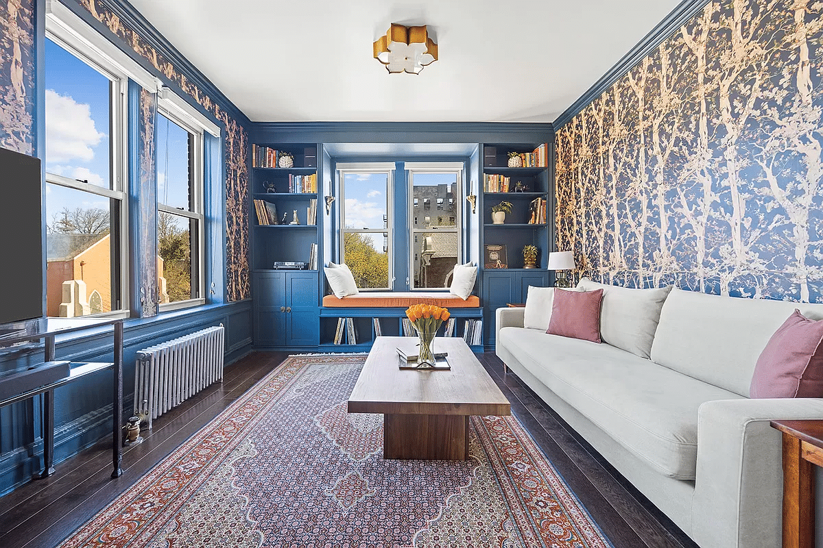
Striking color contrasts are energizing interiors in Brooklyn and beyond. A Massachusetts kitchen by Reath Design zings with Delft blue, lavender, tomato, and daffodil. Shades of azure outline windows and doors and create trompe-l’œil arches in rooms by designers Frances Merrill, Gillian Lawlee, and Hollie Velten.
No stranger to a vibrant mix, New Jersey interior designer and Brooklyn expat Velten went a step further in a client’s basement with “color folding,” her inventive phrase for imbuing the space with interlocking swathes of subtle hue and cheerfully contrasting furnishings.
No small number of rooms exhibit spirited tints in “Uncommon Kitchens” by Brooklyn alum and former House Beautiful editor in chief Sophie Donelson, out from Abrams. Retailers and makers are flashing on the trend with a bevy of boldly hued wares as disparate as rugs, wastebaskets, refrigerators, and bathroom sinks.
Having painted the staircase in her Carroll Gardens townhouse shocking pink, designer Fawn Galli has moved onto black and white with pops of color in another brownstone nearby. In the living room, parrot green curtains contrast with sunny yellow shelves and a turquoise chair.
Editor’s note: A version of this story appeared in the Spring/Summer 2023 issue of Brownstoner magazine.
Related Stories
- Design Currents: Creatures Great and Small
- Square Deal: Brooklyn Designers Check Into Plaid
- Curves Ahead: Brooklyn Designers Swerve Toward Curves
Email tips@brownstoner.com with further comments, questions or tips. Follow Brownstoner on Twitter and Instagram, and like us on Facebook.


What's Your Take? Leave a Comment