Friday Flash: What if and why not
No: 1231

Berkshire Hathaway HomeServices had succeeded in becoming a top global real estate network. But the visual identity and brand strategy the company launched with in 2013 had become limiting.
Everything needed to work, to cohere, worldwide. People had to feel and believe from Manhattan to Mumbai.
This was the charge given to us by Wendy Durand, BHHS SVP of Marketing.
1,500 offices. 50,000 agents. Urban, suburban, exurban. Resort. Condos. Starters. Superluxe.
One brand.
Warren Buffett’s brand.
No pressure.
We began.
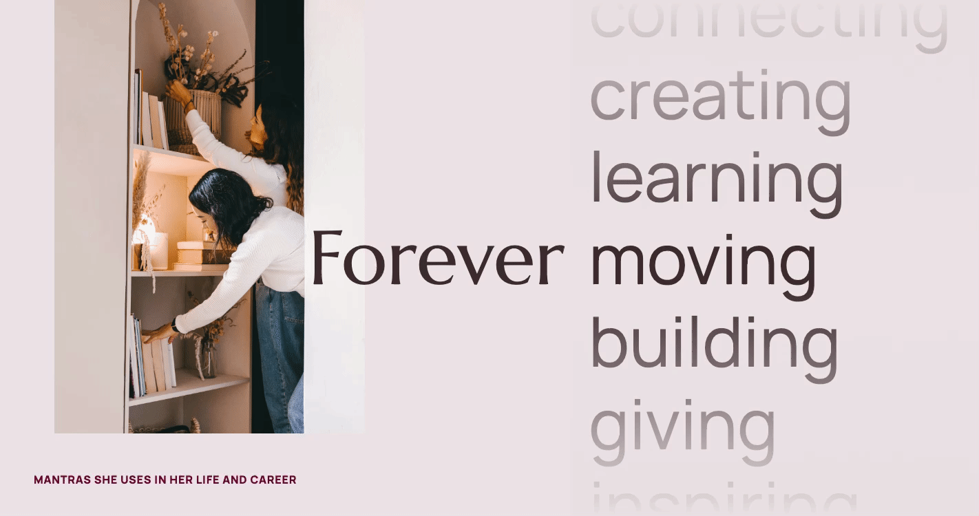
BHHS had staked its claim as real estate’s “Forever Brand” a few years back. This made sense to us. The Berkshire Hathaway brand is anchored in stability, trust, and values that endure. But the idea needed to be brought to life more fully.
So we worked with the BHHS team to map out a complete brand foundation and strategy. We delineated what forever meant, and how a forever brand acted.
This strategy work is far harder to show than visual design work, but it is every bit as important. So is listening. I know, a cliché. But it’s true. We talked with agents and brokers across 12 countries about what they needed, and listened with a sensitivity that comes from a deep understanding of the real estate world.
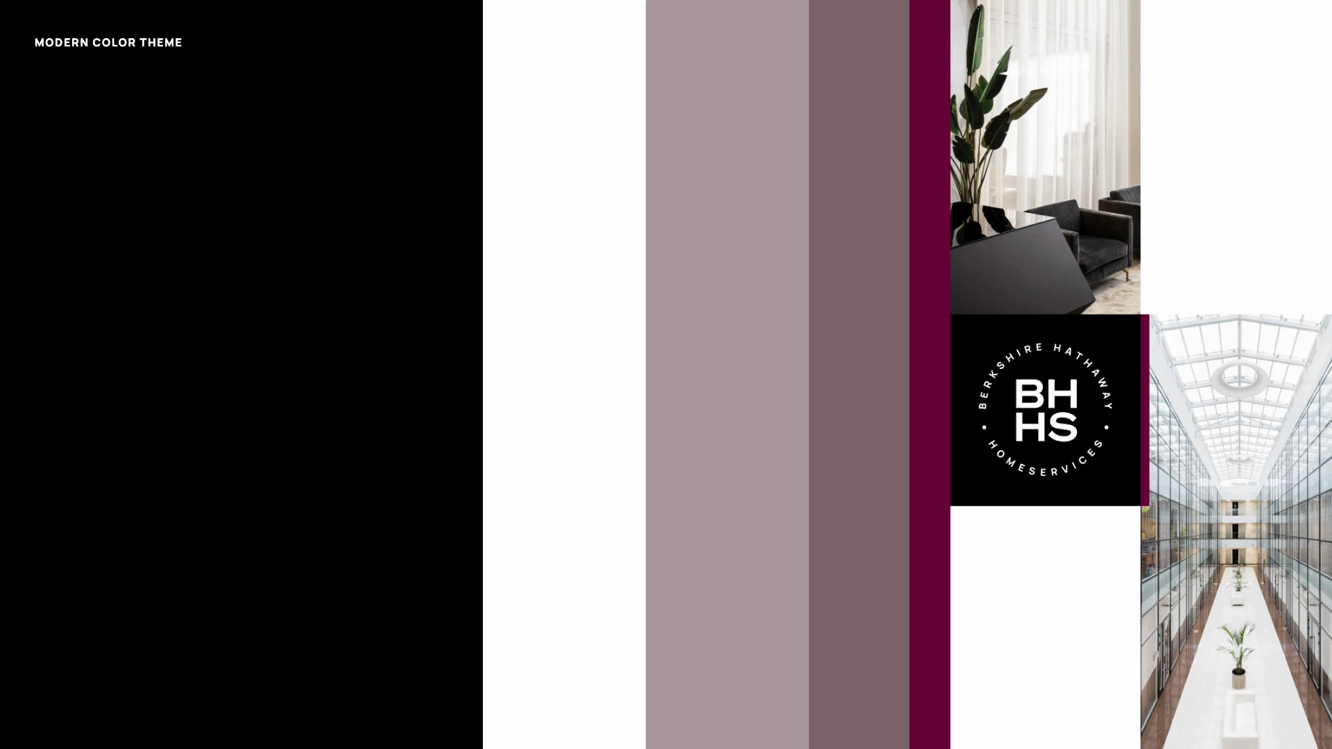
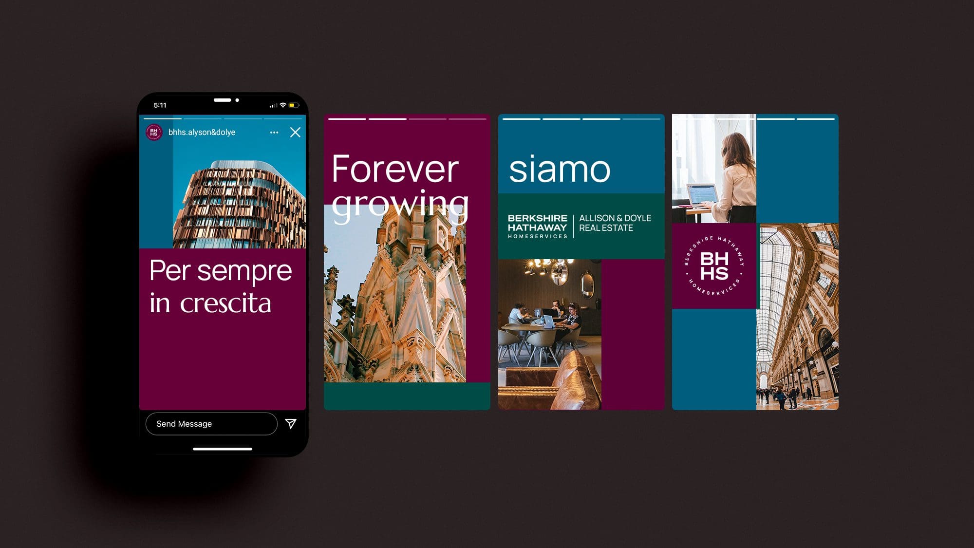
This led to novel solutions like an adaptive color palette featuring distinct “themes” that accommodate the full breadth of the network while also maintaining coherence, and an upgrade to the brand’s cherished “Cabernet” color that delivers more liveliness.
Our work included a new logo, type, grid system, monogram, and much more.
You can look at some of the outcome below, but do check out the page on our site highlighting this work if you want a full picture.
We are grateful to Wendy, Christy, Neill and the rest of the BHHS team for the opportunity to do this work.
![]()

No: 1231