
Nothing gets mouse-clicks quite like the word “bubble” in a headline, does it?
Somebody noted in Monday’s comments section that the Toronto Star article I took issue with was probably written for this exact reason: to get clicks.
So if you want results, use the word “bubble.”
In fact, if I type in “Toronto Real Estate” to Google, one of the auto-complete options is Bubble.
Here’s a headline from Tuesday:

Yeah, it’s sexy.
It gets clicks.
And it’s old news to people like me who have seen this over and over.
Whether it’s Bloomberg, OECD, or UBS, I’ve seen this before.
Let me look into the archives for a moment and see what I can find.
Ah, here’s something from the “UBS Global Bubble Index” in 2017:

Wow, Toronto was number one on the list?
Yikes!
And did the bubble burst? Ah, sorry, that’s rhetorical.
Let’s see what else I can find…
….ah, here, from 2020:

So when UBS’ “Bubble Index” was written in 2020, even though they had called Toronto a “bubble” every year prior, they kept going back to the well for more.
2.12 in 2017, 1.95, in 2018, 1.86 in 2019, and 1.96 in 2020.
But prices kept rising.
Here comes the cynicism, folks, but it seems to me like the “indicators” are not really indicative of a bubble bursting.
If you want more cynicism, I wrote at great length about the UBS Bubble Index in this 2019 blog post:
October 23rd, 2019: “UBS Global Bubble Index”
Every year for the last six or seven years, we’ve seen Toronto rank on various publications’ “bubble indexes” or “froth-meters,” whatever names they can create, and while I recognize that this is not borne of desire for clickbait, it certainly becomes that for the newspapers.
On Tuesday, it was Bloomberg Economics that provided their take on the “World’s Frothiest Housing Markets,” which are based on particular indicators, specifically real house price growth.
How is this for a sexy headline?

Pretty damn sexy!
Atop that list is New Zealand, Canada, and Sweden.
But you already knew that because the Financial Post article said so.
In fact, when you dig into this a little further, it looks like this: the Financial Post (and others) write about what Bloomberg Economics wrote about, but Bloomberg Economics wrote about what OECD wrote about.
OECD?
Who is that?
The Organization for Economic Cooperation and Development.
It’s an intergovernmental economic organization with thirty-eight member countries, founded in 1961 to stimulate economic progress and world trade. (thank you, Wikipedia).
So when OECD compiles data from these thirty-eight countries, if you’re one of them, you’ll want to pay attention to what’s going on.
I spent a good portion of Tuesday reading the major newspaper headlines and accompanying articles, and the idea of a “frothy” market in Toronto, or being in a “bubble,” is going to provide for more stories and more headlines as the week progresses.
But you’ve heard all of that before. It’s almost old at this point.
So what else does the OECD data tell us? Is there anything else we can learn about real estate in Toronto, by looking at real estate worldwide, that won’t be reported by the Toronto newspapers because they only want to tell the story of a bubbling, frothy market?
Yes, actually, there’s quite a lot we can learn. In fact, I was fascinated by the OECD Housing data! I spent a good amount of time on Tuesday reading through some of their reports, watching their videos, and combing over their data. So just for fun, let’s take a moment to look at some of their slides and graphs and see how Toronto stacks up against the other thirty-seven OECD countries in various metrics.
–
We walk quite a bit on TRB about the cost of housing as it compares to other expenditures, and while I often muse that young people today are spending their money on disposables (dinners, entertainment) and thus have little left over to pay for housing, the following chart tells us otherwise:

Again, this is in twenty OECD countries.
This is not representative of Toronto.
So is it possible that the millennials in Austria, Belgium, Spain, the UK, et al have different spending habits than their counterparts in Toronto?
Maybe, maybe not.
Or maybe housing is just so damn expensive now that no matter what your spending habits are, you’re going to see a higher percentage spent on rent or mortgage.
–
Now here’s a very interesting look at real house price index versus rent price index dating back as far as 2005:
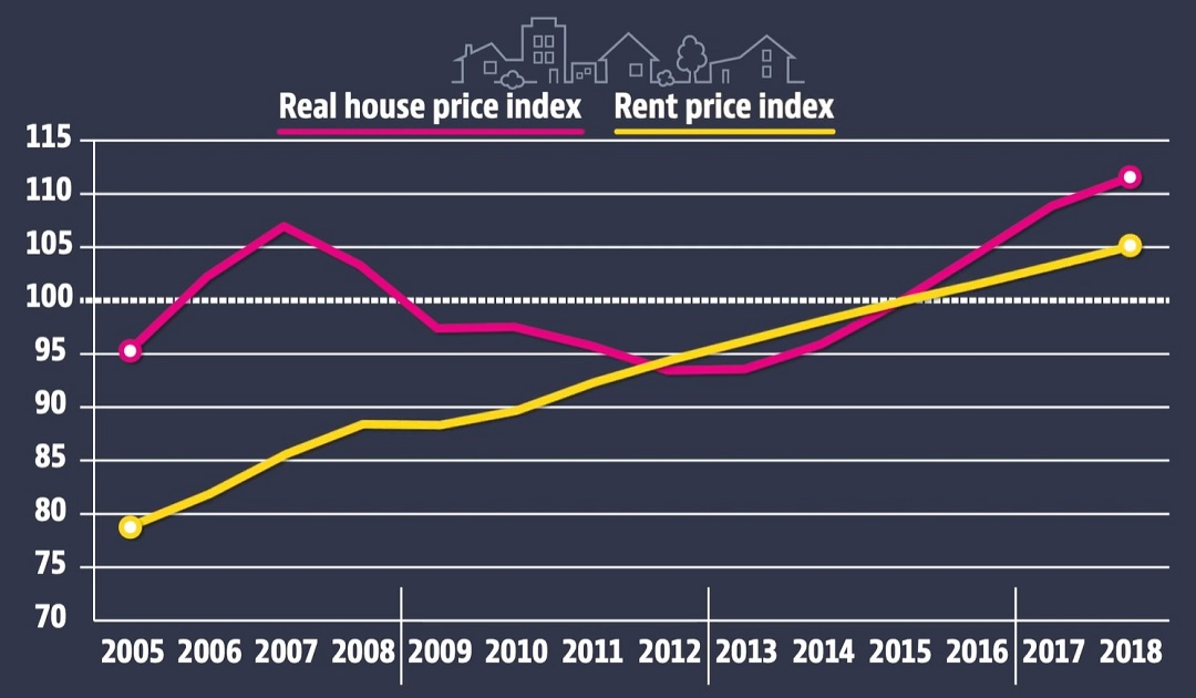
While the real house price index has fluctuated, the rent price index is as straight a line as they come!
Again, keeping in mind this is 38 countries in OECD, not just Toronto.
The supply-side proponents among us believe that the key to our housing crisis lays in the ability to build houses and condos, provide incentives to developers, create low-income apartments, and improve supporting infrastructure that would ease housing demand, such as public transit.
–
So how has public investment in housing moved in the OECD countries in the last twenty years?
Downward…

Save for a minor bump one decade ago, it looks as though public investment in housing has been reduced by two-thirds.
This is not a good look for those countries with a housing problem.
–
This next slide really needs no explanation.
But since we’re at it, define “overburdened.”
How about working every night from 8pm to midnight after you put your kids to bed, and not spending any time with your wife? Oh, wait, that’s something else.
I mean, define “overburdened” as it pertains to the amount of income you spend on rent or mortgage.
The days of 36% are long gone, apparently.
The following slide shows which OECD countries see people, on average, spending forty percent or more of their income on rent or mortgage:
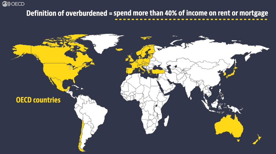
Ummm………that’s like, almost all of them, is it not?
Which countries are not highlighted in yellow?
Costa Rica?
Seriously, I looked at this map for quite a while and nothing else is jumping out at me.
–
Here’s an interesting chart, although I’m curious as to why they chose the age range that they did:
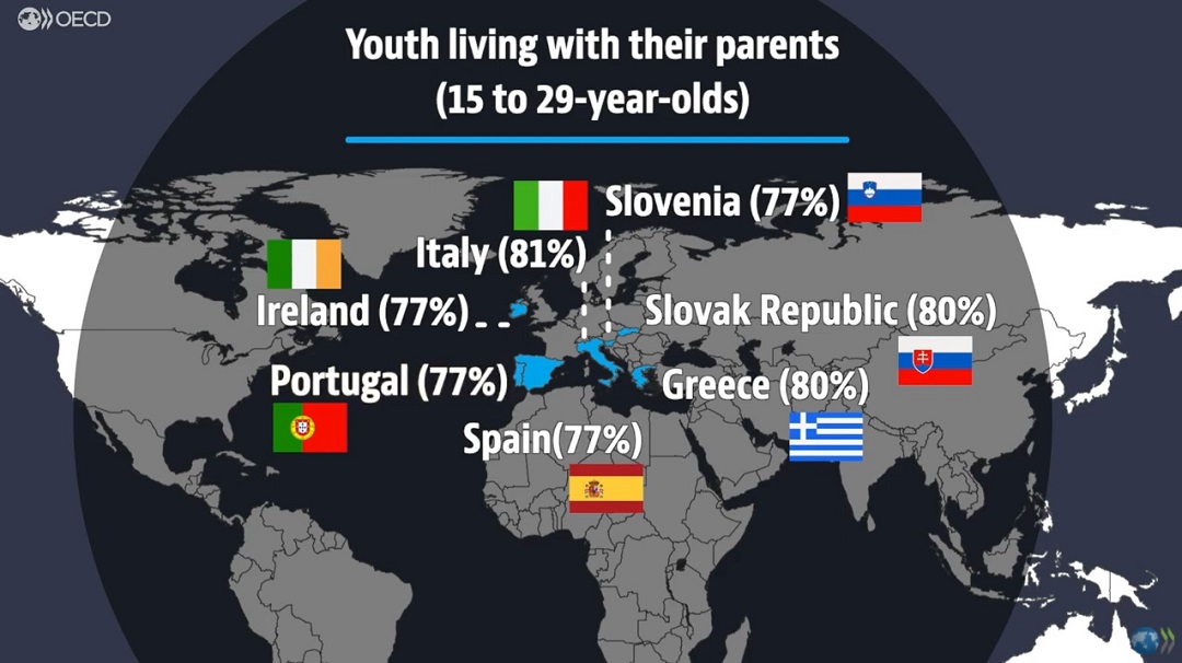
29-years-old and still living at home with your parents? Not something you put on your resume, but very common in Toronto.
15-years-old and not living at home with your parents? A major, major concern!
This is a really odd slide, and I would love to know the percentages of individuals between 25 and 29 years old who are still living with their parents.
–
Here’s something that could renew the conversation about a very, very controversial topic:

What is meant by “foregone revenue from tax relief for home ownership?”
There are a lot of ways that a government might “forego” revenue.
An exemption of land transfer tax is a good example.
How about countries where your mortgage or mortgage interest are tax-deductible?
How about the lack of an inheritance tax on real estate?
What about a special savings account for money going toward a real estate purchase?
There are actually a lot of ways in which OECD governments forego tax revenue associated with real estate, and perhaps that could be a topic for another day
But what does that light-blue bar for Canada mean by “other?”
Tax-free capital gains on a primary residence.
–
And last but not least, I really had to search for this one but thankfully the OECD Housing section has loads of data on affordable housing, government investment, etc. It’s fascinating stuff, but check out this graphic:
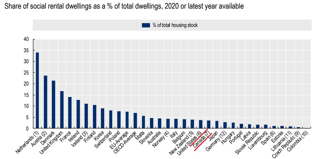
As the graphic shows, Canada ranks well below the OECD average when it comes to the share of social rental dwellings as a percentage of total dwellings. We’re actually behind the United States, which is shocking.
I could go at this all day. There’s absolutely no shortage of fascinating data on the OECD Housing site, and it’s all free!
Draw your own conclusions here, or not. Maybe you came to TRB today hoping to be amused by another edition of Photos of the Week, and instead, found some graphs that bored the hell out of you. But others might bookmark the OECD Housing site, which I’ve just hyperlinked. I’ll tell you what’s worth a read: the entire section on tax relief for homeowners. It’s a girthy fifteen pages but you can literally look at every country’s tax relief measures, specifically for first-time buyers, which I found quite enlightening. I think I’ll put that in the queue for a future blog post, but I’m all ears if you want to email me with a few takeaways of your own…


hoob
at 7:25 am
The burning question I have, is, why is Lake Michigan in white and the other Great Lakes in blue. Is Lake Michigan a cheap, livable haven of docile houseboats?
Jimbo
at 1:22 pm
Doesn’t have a shared border and it isn’t land. Very awkward looking
A Grant
at 7:45 am
I use OECD data regularly for work, so your “discovery” put a smile on my face.
Akin to my elderly mother discovering the wonders of the internet for the first time.
Be warned, you can go down an OECD information rabbit hole real quick.
Meanwhile, despite this data, millennials can’t seem to shake the stigma that they’re a bunch of self-indulgent, avocado toast eating slackers whose unwillingness to put in an old fashioned hard days work leaves them unable to afford a home.
Island Home Owner
at 7:46 am
Thanks for the awesome post, David. Hope you and the family are well and staying safe!
Appraiser
at 8:00 am
Great info and data today David.
Certainly puts the dire plight of housing in Canada narrative into perspective. I too am startled to learn what a pittance Canada invests in social housing.
The housing crisis in Canada has to be healed from the bottom up. A wealthy country like Canada should have a homeless population of next to zero, but we all know that is not true. Adequate social housing and homeless shelters come first.
Once we have that solved, then we can heap pity and tax dollars on those poor souls who can only afford a parking space or a locker?
“Shut Out of Big City Housing Markets? Get Used to It, Say Experts”
“There is a ‘Manhattanization effect’ in Toronto,” John Webster, head of real estate secured lending at Scotiabank said during a recent VERICO webinar.
“Webster says we should expect to see cities like Toronto and Vancouver become “beyond many people’s reach,” similar to how Manhattan is unaffordable to most. That’s something young people don’t want to hear, but it’s something they’re going to hear more and more.” https://rates.ca/resources/shut-out-big-city-housing-markets-get-used-it-say-experts
jeff316
at 10:32 am
81% of Italian young adults living at home. Love it.