
I have never, not once, dove head-first into a pool.
But that tracks, right?
Considering I felt the need to specify head-first when I mentioned “diving,” it just goes to show you how unfamiliar I am with this past time.
I guess I just never saw the point? Is there something exhilarating about going in head-first instead of feet-first? Or does one feel the need to be as aerodynamic as possible when breaking the water’s surface?
Then again, my thoughts on the matter are clearly affected by a deep, dark secret that I have been carrying for some time now. It’s something I have never shared here on TRB, and one that I feel might cost me future business.
But here goes:
I’m that guy who plugs his nose when he jumps in the water.
What can I say?
It was a habit that started when I was a child, and I never got over it.
We all have a “thing” and that’s mine. So while it may not affect my ability to sell real estate, I would also add that it doesn’t affect my ability to analyze real estate statistics either. No matter how deep a dive we want to take on the current TRREB stats, I’m well prepared, and more importantly, I won’t get water up my nose!
When I ran my monthly “TRREB Stats” feature two weeks ago, one of the readers asked if I could break the stats down further.
Forgive me, but sometimes I worry that the stats posts are boring. They might be among my favourite, but I know that every reader has their own “thing” and while some prefer tales from the real estate trenches, others prefer photos-based blogs about housing styles or interior design, I know some readers do favour the stats posts.
Perhaps a shallow dive isn’t going to win any favours among the readers?
Our TRB reader asked to break the stats down by property type, but that won’t necessitate an entire blog.
So today, let’s break down the stats by property type, TRREB district, different “types of averages” (we’ll come back to that), and all the while, we’ll compare the current TRREB stats to the peak in 2017, the peak in 2022, and the peak in 2023.
Sound good?
First and foremost: some definitions…
The 2017 real estate “cliff” occurred in the month of April, and the average home price dropped substantially. It was a real estate armageddon for many, but others figured that the market would come back, and it eventually did.
The all-time real estate high in our market came in February of 2022, after which the market dropped off, and it has yet to return to that level.
AS for the 2023 “peak,” that occurred in May of last year, and since we’re currently sitting here in April, analyzing March’s stats, and looking ahead to the month of May, I thought this would be our third point of comparison.
As for the analyses that we want to do, we’ll look at:
Property Type: Detached, Semi-Detached, Rownhouse, Condominium
TRREB District: Toronto, Peel, Halton, Durham, York
Average Type: GTA Average, 416-Average, TRREB HPI, 416 HPI
I’m going to start with the latter and explain what this is and why we’re looking at it.
From the files of, “You can make numbers say anything you want,” comes a slew of different metrics and measures that anybody could select to represent the “average.”
I typically use the GTA Average, but it’s not unreasonable to simply use the 416-Toronto average either. But there is a home price index, which is a much less volatile measure of the market, and this exists both at the GTA level, which we call the HPI TRREB as well as the 416-Toronto level, which we call the HPI 416.
Let’s look at these first:
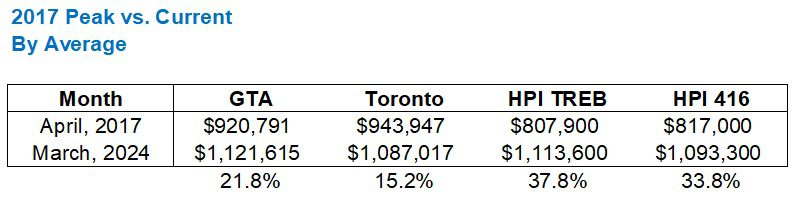
As you can see, the market is up significantly from the 2017 peak, but who figured that it wouldn’t be?
A few blog readers who commented as such back in the spring of 2020, that’s who. A few that predicted that the average home price would “never” surpass $920,791, adjusted for inflation, that is.
As you can see, the 416-Toronto figure lags the overall TRREB (GTA) market, since such incredible price gains were felt outside the central core during and after the 2020 pandemic.
The HPI figures are well ahead, and I believe they represent a better overall measure of the market. For example, I don’t think that an “average” 416 house is only up 15.2% since April of 2017.
Now, let’s look at the all-time peak in February of 2022 and compare it to last month’s price:
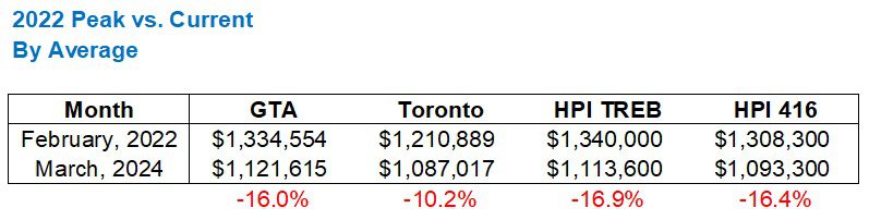
Interesting that the GTA measure is in line with both HPI measures, isn’t it?
But also interesting that the 416 has declined far less than the TRREB average, and again, this really underscores just how inflated the market was in areas like Peel, Durham, York, and Halton when the market peaked in February of 2022.
Lastly, let’s look at how last month’s TRREB data compared to the height of the market in May, 2023:
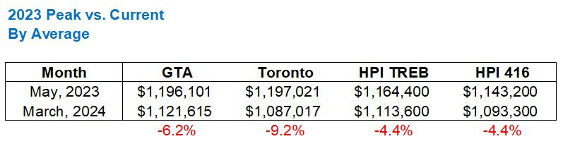
I found this to be really interesting.
I didn’t expect to see this level of decline in the 416, but as I’ll show you later, the 416 actually leads the five major TRREB districts in decline since the peak in May of 2023.
Let’s turn our attention to property type.
Again, repeating the exercise, we’ll compare April of 2017 to March of 2024:
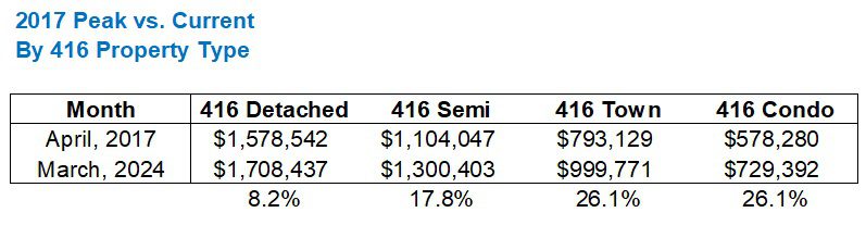
Do you find it hard to believe that the average 416 detached is only up 8.2% in seven years?
I do.
Maybe this is why the HPI is a better measure?
Or, maybe, just maybe, the HPI is higher because ALL the other property types are higher, and many of the other TRREB districts are as well.
I’m not being facetious. I generally could make an argument for either.
But if we take a detached house in the central core that sold for $1,500,000 in April of 2017, there’s just no way that it would only sell for $1,623,000 today.
Here’s how last month’s data compares to the all-time peak in 2022:

This tracks.
It’s basically the opposite of the chart above, although there’s no correlation there.
Again, I would ask if a detached house in the central core that sold for $2,000,000 in February of 2022 would sell for $1,648,000 today. But I surely don’t think that a condo selling for $822,090 in February of 2022 would sell for $729,392 today. I’m just not seeing that.
Maybe the numbers lie or maybe they simply deceive, but either way, these don’t exactly translate on paper.
Speak of which: the 2023 peak versus last month…
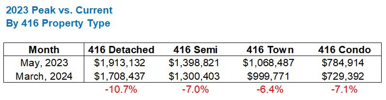
This definitely doesn’t track either.
I don’t see $3,000,000 detached house in Leaside, selling in May of 2023, suddenly selling for $2,679,000 today.
While I think the 2022-comparison is not in line with actual market conditions in the 416, the 2023-comparison is absolutely whack.
There were 9 offers on a listing tonight over on Dan Leckie Way. It’s Dan Leckie Way, folks!
Now, how does the 905 compare to the 416?
If we look first at the 2017 peak versus current pricing, we see a massive difference:
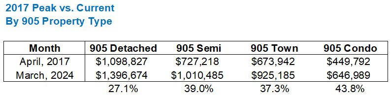
Prices in the 905 are way, way further ahead!
Actually, this is a bit tricky to compare since you’d have to scroll back up.
Let me plot them against one another, and we’ll just look at detached and condo for simplicity’s sake:
That’s quite shocking, isn’t it?
Now again, to be fair, I have a really hard time believing that ANY detached property in the 416 is only up 8.2% since April of 2017, but from a stats perspective, the differences here are shocking.
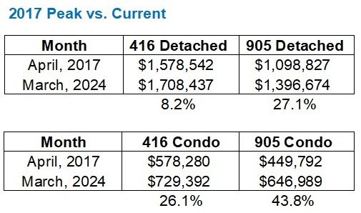
Let’s forget the full 905 figures now and just stick with the 416 vs. 905 comparisons, moving now to the 2022-peak versus current:
While we saw the 905-detached market more than triple the gain in the 416-detached market from 2017 to current, we see the two figures pull even (in this case, both with losses), when we compare from the February, 2022 peak to current.
This is likely because there was such an incredible run-up in prices in the 905 during the pandemic, and the 416 has held more of the overall gains.
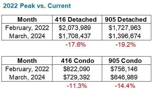
Lastly, let’s run the 416 vs. 905 comparison for the 2023 peak to current:
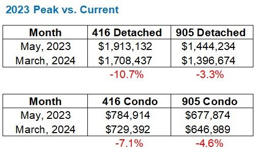
Be careful now – this is deceiving.
It might look like the 905 is “much further ahead” but this actually means that the 416 saw a greater comeback from those 2022 figures than the 905 did.
For example, the 905-detached price was down 19.2% last month from the 2022 peak but “only” down 3.3% from the 2023 peak.
Sure.
But this isn’t a point of strength.
This is saying that from 2022 to 2023, the 905 price didn’t move as much as the 416 price did!
This is made even more obvious when we look at the same time period comparisons across the five major TRREB districts, starting with 2017’s peak versus current:
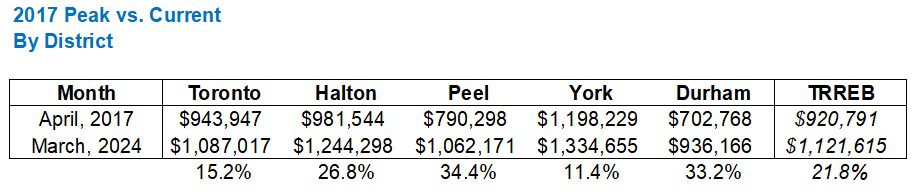
This tracks.
Prices rose massively in the suburbs during the pandemic. We know this.
And in the 2022 chart, you’ll see more of what we saw above:
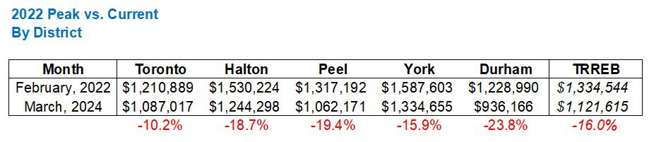
This tracks too.
Prices have dropped more from the 2022 peak in the suburbs than in the 416.
But here’s where you have to be careful, as with above, not to be confused:

Prices haven’t dropped as much in the suburbs because they never recovered as much.
Does that make sense?
The all time “peak” in February of 2022 saw an average home price of $1,210,889 in the 416, and after a huge decline and a small comeback, the 416 price had almost pulled even at $1,197,021 in May of 2023.
Compare this to any of Halton, Peel, York, or Durham, and you’ll see what I mean.
Still not sure what I mean?
Alright, one more chart:

That is what I meant.
The 416 saw a much larger comeback from the 2022 peak than the suburbs did, but the 416 also has seen more of a decline since 2023’s peak.
I’m convinced that after April and maybe even May, the 416 data will be so strong that my “gut feeling” not lining up with the data will all but vanish.
For now, I just hope that this extra look and deeper dive into last month’s figures gives the stat-hounds what they’re looking for…


JF007
at 8:53 am
David…phew!!! I am in gluttonous territory now 😀
Ed
at 5:37 pm
Forgive me, but sometimes I worry that the stats posts are boring.-David
The jury is in.
One single comment.
David Fleming
at 12:53 pm
@ Ed
Forgive me, but I consider my job here are TRB to be providing “something for everyone.” Inclusivity is so hot in 2024!
Stats posts don’t attract commenters as there’s not much to say. But not every post can be a rant about the government.
Alright, I’ll call it now: Monday’s post gets comments simply becuase it’s controversial, somewhat about politics, but the type of post that people NEED to respond to!
hoob
at 8:24 am
why waste time say lot stat when few stat do trick
Crofty
at 4:53 pm
“Don’t give me information, give me your opinion, so I can attack it.”
Our species is so screwed.
Ace Goodheart
at 9:36 am
Stats confirm what I have been thinking.
Toronto resale market is on life support and the high list prices, dearth of listings and lack of sales is a swan song type of situation.
Everyone is waiting for interest rates to go down so prices can go back up.
What I see is the BoC losing control of the economy.
As long as the USA continues on an economic tear and the Fed keeps rates high, the BoC has a hard choice.
1. Keep CDN rates high and crash our economy or
2. Lower rates, crash our currency and cause inflation, then raise rates again.
We are in trouble up here.
QuietBard
at 11:48 am
“But if we take a detached house in the central core that sold for $1,500,000 in April of 2017, there’s just no way that it would only sell for $1,623,000 today.
I don’t see $3,000,000 detached house in Leaside, selling in May of 2023, suddenly selling for $2,679,000 today.
Now again, to be fair, I have a really hard time believing that ANY detached property in the 416 is only up 8.2% since April of 2017, but from a stats perspective, the differences here are shocking.”
I think statements like these underscore just how stats of averages can be a bit confusing and lead to misunderstandings. I have no doubt the $1.5Mill central core home you thought of in your example would sell for way more than $1.62Mill (or 8.2%). But you cannot compare “ANY” home to the average that wont work. That home is just 1 example of all of the homes that go into the average. You also have to take the “crappy” or “less desirable” homes into account. Would a dilapidated house in the central core have sold for more than 8.2%? Or less? How about a home with no parking and a fire hydrant in the front so it has no parking spaces? What about a home that had a quadruple homicide? Or one leaking asbestos, or nuclear waste. The point is that the average takes into account every single type of home in a region. The incredibly fabulous ALONG with the embarrassingly shameful. When you use your experience to create an example it is just a small portion ( or subset – in math terms) of the entire region (set or population – more math terms).
“I’m convinced that after April and maybe even May, the 416 data will be so strong that my “gut feeling” not lining up with the data will all but vanish.”
Your “gut feeling” isn’t wrong. It just isn’t representative of the ENTIRE market. It is only representative of the segment of the market you operate in, which to be fair is probably much larger than the average real estate agent. But not quite as large as some blog commenters 🙂
Stats are just stats they have no meaning. The meaning is derived from the individuals that look at them and draw conclusions based on their experiences and training. The value is determined by the actions taken on those insights.