
Do you remember that thing we used to do all the time before March of 2020?
What was it called, again? That thing we did?
Oh yeah, “getting sick.”
The one positive by-product of this soon-to-be two-year pandemic is that with all the hand-sanitizing and mask-wearing, we’ve basically eliminated the common cold!
That is, until, last week. It’s the exact same cold I’ve had every January from 2002 through 2020. It starts one morning when my coffee tastes funny, then that night, I get a little bit of a sore throat. That night, or the next night, I have that miserable sleep, and the following night, I wake up six times covered in a cold sweat. Congestion, headaches, and rubbery legs follow, but the part I hate the most is that feeling of being dumb.
I’m just about over this cold, which just had to take place while I carved out three days to visit my brother and his family at their cottage, but I still have that feeling of dumb.
So, why not sit down and analyze real estate statistics, then try to eloquently write about the findings?
Sure!
TRREB couldn’t have published these stats last Wednesday, right? So I could write about them before Appraiser and Chris did?
A day late, a dollar short, and a post about basement bars to boot. As a friend of mine says, “Ah, I see ‘mail-it-in Friday’ comes on Thursday this week?” How mean! I like my photo-themed posts, thank you very much!
Before I get into last month’s real estate statistics, I first need to provide a brief refresher on the 2020 real estate market.
Many of you lived through this, most of you read TRB through this, but if we’re going to try and put July statistics in context, we need to look back at why July and August of 2020 were what they were.
The pandemic first affected the Toronto real estate market in late March after the first “shutdown” took place on March 17th, and while March sales were on a record pace through the first two-and-a-half weeks of the month, they really slowed thereafter. But it wasn’t until April that we saw how much the pandemic had affected the market, with only 2,975 sales, compared to 9,042 in April of 2019; a 67% decline! Sales in the month of May rose to 4,606, but that’s not a typical May figure! This was down 54% from May of 2019!
The market came back in June, but it wasn’t until the summer that we really saw the impact the pandemic had on the real estate market.
Many of us, myself included, figured that the market would take a pause and then slowly move forward. But we didn’t foresee the massive number of people who realized, either through working at home, or sharing a space with their partners and/or children for months on tend, that their current space wasn’t the right space.
Combine this with the fact that some 15,000 lost sales from March, April, and May would now be thrust into July, August, and beyond, and suddenly it made for an absurd summer market!
The 11,081 sales recorded in July of 2020 were insane.
It was an all-time high for July. It was a 29% increase over the same period in 2019. It was also 11.6% higher than the previous record set in July of 2016.
This was anything but a typical July, and it only happened because of the pandemic. If we didn’t lose all of those sales in the spring due to the shutdown, and if we didn’t see swarms of people realizing they needed a different living arrangement, we probably would have seen the typical 8,000 – 9,000 sales that July usually produces.
So why the refresher?
Well, because I really don’t know how to look at the July 2021 numbers and put them into any sort of context after seeing a pandemic-induced frenzy last year.
I think the Toronto real estate market is at a crossroads.
On the one hand, we can’t possibly expect this market to continue. Prices have risen for two decades, the average home costs $100,000 more now than last year, the first six months of the year were red-hot across the board, and there must be a limit to how much the Toronto market can increase.
On the other hand, we are one month away from the start of what I expect to be a very, very busy market. The fall market is like the spring market on steroids, since it’s only 2 1/2 months long and it seems like the same number of people expect to transact! Not only that, the problem in our market right now, and the reason why I think we’re going to see prices increase in the fall, is the same old culprit: inventory.
Having said that, the average home price in Toronto did not increase from June to July.
Here’s a running tally on the TRREB average home price since the start of 2020:
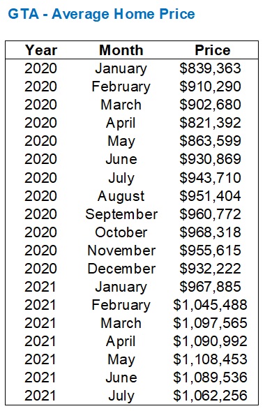
The average home price was down 2.5% last month, but still within that “new” range that’s well over a million dollars, as you can see from February onward.
Anybody who thought that we were just seeing a hot January, or that February was an outlier, clearly must see now (without the blinders on…) that this price floor is here to stay.
The average home price is down over four percent since the peak in May, and while some houses probably are “worth” four percent less, others are worth exactly the same, or more. The expectation is that the average home price in September and October is back at, or above, that $1.1M figure, but in the meantime, how does that 2.5% drop from June to July stack up against previous years?
Let’s go back fifteen years, shall we?
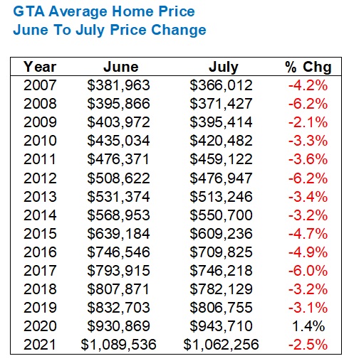
Huh, how about that?
The average home price drops every single year from June to July, er, except when we have a pandemic!
That 2.5% drop is less than every year dating back to 2009.
So, the 2020 pandemic-infused summer aside, it looks like a 2.5% drop is actually a good sign for the market.
Sale prices serve as the appetizer today, however, It’s inventory that I think is the true story of the market this summer, and will be a huge story this fall.
You simply can’t imagine what last month’s inventory figures looked like, and since a picture paints a thousand words, I’m going to show you in a chart.
First, look at the number of new listings compared to each July dating back fifteen years:
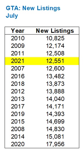
From June to July, new listings dropped by 22.5%. That’s probably to be expected, as summer is always a slower period.
On a year-over-year basis, new listings dropped by 30.1%. But new listings in July of 2020 were at a fifteen-year high, so again, not really a fair comparison.
But in the context of the last fifteen years, you can see just how low new listings really are.
That’s nothing, however, compared to active listings, which will now demonstrate the power of “a picture painting a thousand words” here:
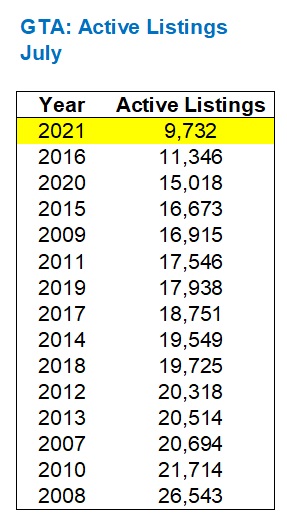
That’s not a typo, folks. I checked.
That’s 9,732 active listings in the city of Toronto in July of 2021, which is the fewest ever and sticks out like a sore thumb in the chart above!
If you knew nothing about Toronto real estate and just showed up yesterday, then asked, “Why is real estate in Toronto so expensive, and what has changed in the last ten or twenty years,” that chart above would explain it.
Just think about how different the market would be if we experienced 20,000 or even 26,000 active listings instead of 9,732?
But this is where we are today, and when people lament that “real estate is unaffordable in Toronto,” they need look no further than this chart, then consider inventory, then wonder why naysayers, market bears, and the government constantly moan about investors, real estate agents, and the need for more taxes to “help” the housing crisis.
Fewer people are selling their homes. Period.
That’s the issue in our market, and when you combine that with the fact that inventory is being absorbed faster, you understand where our market is right now, and where it’s headed this fall.
We saw “only” 9,390 sales in July of 2021.
This is down 15.5% from June, and it’s down 15.3% from July of 2020.
But if fewer properties are being listed, then is it a wash?
That’s where our good friend SNLR comes into play!
Let’s look at the SNLR for each month thus far in 2021:

As you can see, the SNLR currently sits at 75% which is the highest point of 2021.
Inventory is going to rise dramatically in September as it always does. I’ve got at least a dozen listings in the queue, none of which I would bring to market in August, or even July. But what does this 75% figure mean?
First, let’s see how SNLR usually looks in July by going back a decade:
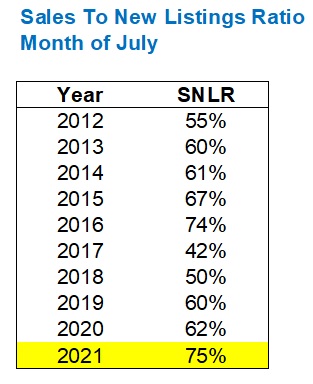
Alright, so 75% is high, it would seem.
But one might argue that to compare year-by-year is misleading, so then let’s see how the increase from 69% in June to 75% in July looks, dating back a decade as well.
Why would we look at this?
Well, if SNLR moved from 59% to 65% last year, and 61% to 67% the year before, and thus we’re always seeing a 6% jump from June to July, then this year’s 75% SNLR in July might not seem as spectacular.
Here’s how the movement from June to July typically looks:
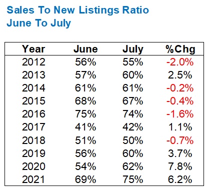
Well, if you take out the pandemic-infused 2020 figure, the 6.2% increase in SNLR from June to July this year is an absolute outlier!
Sure, we see 3.7% in 2019, but in the previous years, we’re actually into decline in five of seven.
I’m not making this stuff up, folks. I really, truly do see a market with dangerously-low levels of inventory which is signaling a chaotic fall market four weeks from now.
Perhaps even more concerning, is that if you look at how 2021 has gone so far, it bucks the trend from previous years.
Let’s repeat our January-through-July look at monthly SNLR and go back five years, but we’ll take out 2020 just because it’s of no help to us.
Have a look at how the monthly figures start each year, shape up into peak-spring, and then end up in July:

Not one of these years looks like 2021.
We see the “peak” in 2019, as we did in 2021, but 2019 started really slow with that 42% SNLR compared to a 60% peak in July, whereas 2021 was far more consistent in going from 73% to 75%.
We see a similar thin “band” of figures in 2018, working between 44% and 51%, compared to 64% and 75% in 2021, but there’s no peak in the summer.
And in 2017, we saw an SNLR in July that was half of what it was in February, whereas it was just about the same in February and July of 2021.
I certainly didn’t set out today to make an argument about the market, but rather I will say that the argument found me.
I came into this exercise without a real sense of where the data would lead, and along with that feeling of “dumb” as I come off this cold, I thought this would end up as a “head in the sky” or “cloudy stats” themed-post.
Not so much, it seems.
Every month, I look at the TRREB stats with an open mind and as most do, I typically look price first, then sales, then I go to the average prices for each segment (detached, condo, etc), then usually inventory last. This month, I saw that 9,732 figure for active listings, and just knew it didn’t look right.
That had to be the story of this past month, and as the Toronto real estate market takes a quick breather for summer, and prepares for fall, the market finds itself at crossroads.
Go out and do a “man on the street” interview and ask about housing affordability, and you’ll find very few smiling faces in the crowd. It reeks of “something’s gotta give,” and it’s why the market bears always seem to have life in them, despite the past twenty years of price increases.
But look at the inventory figures above, and there’s no denying which road this market will take in the fall if we don’t see a monumental shift in supply.
Expect more of the same in August too…


Francesca
at 7:35 am
I think there is a direct correlation between prices and inventory in the sense that as house prices continue to increase people are less likely to sell contributing to the lack of inventory. It’s just too expensive to move between the two land transfer taxes in Toronto, the realty fees, lawyers and moving costs. I remember between 2008-2013 we had several friends move twice or three times during those years. They were able to leverage some price appreciation between sales and moving even almost laterally wasn’t too expensive. After 2014 anybody we knew who moved, moved out of necessity: divorce, job changes or relocation, massive upsizing or downsizing or complete change of neighborhood. In fact we almost moved in 2013-2014, didn’t and afterwards stayed put until this year when we downsized and moved from the suburbs to the city. It just wasn’t worth moving into a different house in the same area otherwise as the moving costs were too much. As long as inventory remains low, prices will continue to increase due to bidding wars on the few homes for sale. It’s a vicious cycle until something major happens like less new immigrants coming here, scraping or reducing the rate on the land transfer taxes or on realty commission. I don’t foresee any of these things happening.
bob
at 7:03 pm
Couldn’t agree more Francesca. Not intending to take a jab at realtors, but in this housing market, the only winners are banks, realtors, lawyers, government (taxes). Everyone else loses or at the least, “profits less”. Sure the buyers get their dream home, but the higher costs of moving might mean that they’ll have less retirement savings, or less tuition saved for their children.