
Quite the start to the fall market, wouldn’t you say?
Ah, right, I forgot that many of you do not warm your feet by the fireplace while looking at the day’s statistics. So let me put this into perspective for you.
Every real estate agent can customize his or her TRREB home page according to the areas that the agent follows. I check this home page and the associated numbers more often than I check my own face in the mirror, which is to say that these numbers and the way that they’re laid out on the home page are as familiar to me as anything in this world. As a result, when I see something glaring that stands out, not unlike that massive red heater on your forehead on the morning of your wedding day – I take notice.
One of my areas of interest is called “Downtown” and looks at new listings in C01 & C08.
When the market is slow, say, mid-summer (except for this year…) or mid-December, we might only see 30 new listings.
When the market is lukewarm, we may see 50-60 new listings on any given day.
During a “busy” period of the market, I would expect to see 80 listings.
When things are really busy, like, peak season, I think 120-140 is the number.
Here’s a screenshot of my TRREB home page from Tuesday night:
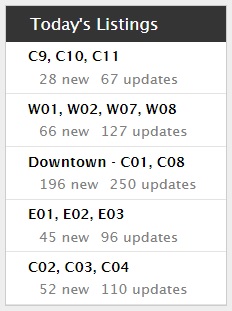
Like I said – it jumps out at you. Like when you grow a mustache during COVID, and you continuously do a double-take when you see your reflection in the mirror.
But unlike the mustache, this insanely high number of listings isn’t as easy to remove! How will the market absorb all this inventory? Time will tell.
196 new listings are the most that I have ever seen in a single day, from what I can remember. And I have a very good memory.
It’s worth noting, however, that the 66 new listings in the west end (W01, W02, W07, W08) was also far more than I’ve seen in a long time, and to see 45 new listings on the east side also points to peak season.
But should we expect anything different?
We are in peak season, after all.
Now how does this play into my “Burning Questions,” numbers 2-through-5?
Here goes…
2) What is going to happen in the condo market?
I’ve been making waves here for over a month, not because I’m pessimistic or because I’m anything but bullish long-term, but rather because I see what’s happening out there.
I think back to January and February when a 550 square foot condo at King & Bathurst was getting seventeen offers, and it seems like an eternity ago.
What’s changed?
Well, for starters, we were in a pandemic!
But I’ve talked continuously over the last two months about how resilient the freehold market is, so why are condos any different?
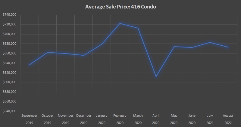
More on that in a moment. First, let’s take stock of where we are with respect to 416 condo prices by looking at the average sale price in the 416 since September of last year:
There are two ways to look at this:
1) The average condo price in August of 2020, of $673,174 is 8.7% higher than in August of 2019.
2) The average condo price in August of 2020, of $673,174, is 6.8% lower than during the “peak” of February, 2020.
Through the last few blog posts, I’ve seen the readers take both stances.
Neither is wrong.
But did anybody buy a condo in February of 2020 with thoughts of selling in August of 2020? I know, I know, now I’m showing my bias…
I want to re-run the same three charts as we did on Tuesday with respect to rentals, only this time, for C01 & C08 resale condominium new listings, sales, and absorption rate.
Here’s new listings:

Right.
Doesn’t look great, does it?
At a time when listings usually peter out, like in 2018 and 2019, the 2020 new listings have skyrocketed!
Again, there are two ways to look at this:
1) Listings plummetted in April and May during a worldwide pandemic, and thus there was more inventory as a result in June, July, and August
2) Listings have skyrocketed in time that is usually slow, and this is merely a sign of things to come
Again, neither outlook is wrong per se, and I might even argue that both can be true at the same time.
What happens next, however, will be telling.
Are we going to see 2,000 condo listings in September? More? What if we saw 2,500 in October?
I suppose the answer all depends on what happens with corresponding sales.
Here’s a look at sales for the same time period:

I suppose there is some good news here – that condo sales in 2020 were higher in July and August than in 2018 and 2019 (grey line > orange and blue lines). But with the massive surge in inventory, it’s going to have a negative impact on the absorption rate.
The drop in sales as a result of the pandemic was just so troubling. Have you ever seen a line on a chart like the one above? Oh, wait, you have – the inverse of the grey line in the first chart, for the surge in listings…
Now about that absorption rate:
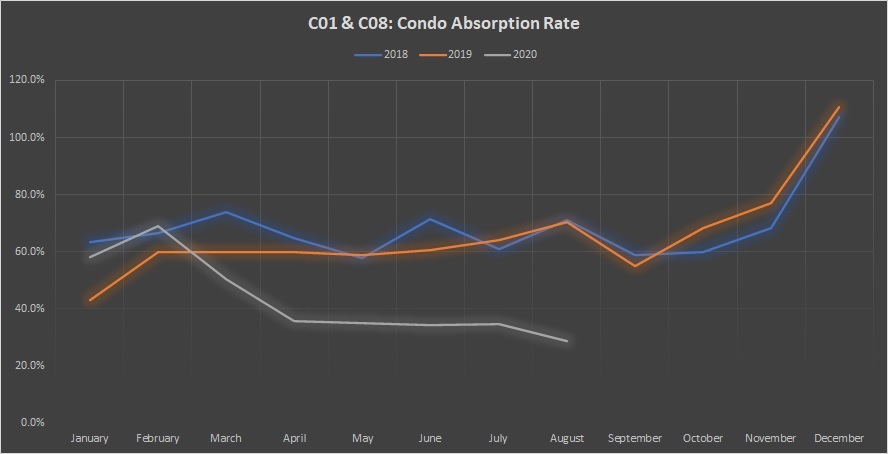
The absorption rates in April, May, June, and July respectively were 35.9%, 35.1%, 34.2%, and 34.6%. These are all essentially in the same “bucket,” if you will, but the 28.7% absorption rate in August is in a bucket of its own.
If inventory skyrockets in September and sales don’t keep pace, then what does this look like? An absorption rate of 20%?
The answer to my question above: “What’s going to happen to the condo market?” I suppose would be, “I’m not sure.”
Sorry folks, but that’s as good an answer as I can provide right now.
–
3) Where is the average home price going? Is this a reasonable metric anymore?
Alright, so technically this is two questions. But I have to think that they go hand-in-hand.
Give me some leeway here, folks, because my analogy is tangental but I encourage you to stay with me, since this comparison has legs…
I’m a big sports fan, and as I have mentioned before in the past, I’m really, really into the statistics. Individual season stats or career stats, awards, you name it. And one of my favourite things to do is look back in hindsight, with today’s knowledge, and wonder, “What could have been?”
Take baseball, for example, and the annual Cy Young award winners as well as MVP.
The way we view the true “winners” of these awards have changed substantially over the years as our understanding of baseball continues to evolve.
I believe that Ted Williams is the greatest hitter that ever lived. Sure, Babe Ruth is the best offensive player, Willie Mays is the best player, period, and Walter Johnson is the greatest pitcher. But the best hitter? It’s Ted Williams, and it’s not even close.
Ted Williams only won two American League MVP awards in his 19 seasons, although his age 24, 25, and 26 seasons were wiped out as he was fighting in WWII (he also missed his age 33 season due to the Korean War). In any event, he placed second in MVP voting four times, including in 1942, to a player named Joe Gordon who played second base for the New York Yankees.
Ted Williams had 141 runs scored, 186 hits, 36 homeruns, 137 RBI’s, 145 walks, and hit .356 with a .499 OBP and an OPS of 1.147
Joe Gordon had 88 runs scored, 173 hits, 18 homeruns, 103 RBI’s, 79 walks, and hit .322 with a .409 OBP and an OPS of .900.
You can see what I can see: that Ted Williams had a superior season in every single way. But in 1942, the voters saw Joe Gordon as somehow “more important” than Ted Williams, or in a sense, “more valuable.” The case back then was often made that the most “valuable” player should be on a team that made the playoffs, and that is what, in fact, demonstrated his true value.
There was an element of subjectivity that was often completely overshadowed by the numbers, and yet that subjectivity would still prevail.
The idea of a Most Valuable Player has changed, and since more teams make the playoffs than in 1942, there would be more eligible players even if we still used the old definition. But the measureables have changed as well, and we have stats at our fingertips.
But then sometimes, the statistics could agree with the subjectivity, and yet both might still be wrong.
I offer no better example than the 1990 American League Cy Young award.
Bob Welch won the Cy Young award in 1990 with a 27-6 record at a time when “pitcher wins” were the be-all and end-all of baseball. After all, a win was the most important thing in the entire sport! So was there a better measure of a pitcher than a pitcher-win?
Roger Clemens had a 21-6 record in 1990, but came 2nd in Cy Young voting. Subjectively, he had six fewer wins than Bob Welch, with the same amount of losses, so clearly Bob Welch was the more valuable pitcher.
Today, we have a metric called “Wins Above Replacement,” or WAR as an acronym, which has become the new be-all and end-all of statistics. It’s essentially the number of wins that a player would provide you with, over the course of a regular season, above and beyond a “replacement” player who is merely average by definition. It’s a complicated calculation that takes into consideration the strength of schedule, the difficulty of ballparks, played in, team run support, and other individual metrics aside from merely pitcher-wins.
Bob Welch may have pitched to a 27-6 record in 1990, but his “WAR” was only 2.9. Bob Welch played for the powerful Oakland Athletics, who as a team, scored 733 runs and allowed only 570. He also struck out only 127 batters in 238 innings and had a Fielding Independent Pitching (FIP) rating of 4.19.
Roger Clemens, on the other hand, pitched only to a 21-6 record but had an astounding “WAR” of 10.4. He played for the Boston Red Sox who as a team, scored 699 runs and allowed 664. He struck out 209 batters in 228 innings and had a Fielding Independent Pitching (FIP) of a league-leading 2.18 (lower is better).
Oh, and for the record, Ted Williams had a much higher WAR than Joe Gordon in 1942. 10.4 to 7.7, to be exact…
So now that you’ve read (or skipped…) my baseball analogy, what am I getting at?
I think that the way we view “Toronto Average Home Price” will change dramatically this fall.
Toronto Average Home Price has long been the go-to statistic for real estate agents, media members, and bears/bulls alike. And why not? Most people only compare about price anyways. Only nerds like us want to know about absorption rates and months of inventory. Who cares about how many houses sell, right? Just let me know what mine is worth.
Over the last couple of years as I have grown more accustomed to analyzing TRREB data, I’ve tried, at times, to show how there’s “more to the numbers” than what you might see on a TRREB press release, or in a 300-word newspaper article. At times, the data looks better than what’s being touted, and at times, it looks worse. I’d like to think that I represent both equally, but I’ll accept if you tell me otherwise.
Most people are naturally guilty of using the statistic that they think works to their advantage.
Case in point: a conversation I had on Wednesday with a would-be condo seller.
His condo is near the waterfront in a building that’s not moving units right now, and a building which also really shows its age, and hasn’t done well in 2020 – even early on in Jan/Feb when prices had skyrocketed. I told him what I thought his condo was worth, and he scoffed.
“I paid $510,000 for this condo three years ago,” he told me. The average home price is up 30% since then!”
Like I said: most people are naturally guilty of using the statistic they think works to their advantage.
I keep all the TRREB stats in a handy spreadsheet, so I pulled it out, and quickly deduced that he was looking at the average Toronto sale price of $732,292 in August of 2017, and the average Toronto sale price of $951,404 in August of 2020, and using that as his applicable increase.
“Give me one second,” I said, as I pulled out a statistic of my own. “Twenty-four-point-six-percent,” I told him.
He asked what that was.
“That’s how much the average 416 condo has appreciated, on paper, since then,” I said.
Amazingly, he said, “Nah, I wouldn’t use that number. I think my place is worth about 30% more.”
I responded, “Well, you’re right about one thing; I wouldn’t use that number either. But I also don’t think your place is worth 30% more either,” I told him.
Then I delivered the bad news: “You paid $510,000 for your condo in August of 2017, but if you want to sell it this fall, you’d be pricing at $599,900.”
He freaked.
He went on and on about how the average Toronto sale price is a “better measure of the market” because it looks at all property types, and is a macro, catch-all, top-down approach to valuation.
Then I went on and on about how there are six one-bed-plus-den units for sale in his building, and that when he bought, his unit was the only one listed.
“There’s a stat you hadn’t thought of,” I told him.
I went on again about how a larger unit was currently for sale for $629,900, and his math had him at $650,000. That larger unit had been on the market now for 17 days.
“Seventeen-point-nine-percent,” I said.
“What’s that?” he answered.
“That’s the TREB HPI increase from August of 2017 to August of 2020,” I told him. “If you truly want a ‘better measure of the market’ that is a ‘macro, catch-all,’ then perhaps a Home Price Index, devoid of massive fluctuations, seasonal variation, and proportion of luxury sales included, might be a good tool for you in this market?”
Ironically, my “gut” feeling of $599,900 was on par with a 17.9% HPI appreciation, which would place his condo at $601,290.
This is merely one example of a conversation I’ve had this week where a chosen metric is absolutely, positively, unapplicable.
Another condo-seller said, “The same unit as mine is listed for sale for $771,000 right now.”
True. But the last two sales, from February and May respectively, are for $700,000 and $706,000. So just because one wingnut wants to waste his or her time with a stupid list price, amid 45 competing listings in the eight surrounding buildings, doesn’t mean you’re “priced well” if you’re at $750,000. That’s a $719,900 – $729,900 listing, all day.
There are a lot of different statistics that we can use to try and gauge the market, and for a while, the TRREB average home price worked. But whenever there are peaks and valleys, there’s volatility in these statistics.
This shouldn’t seem like a novel concept, but different areas and property types do appreciate at different rates.
Using the same time period as above, August of 2017 to August of 2020, let’s look at the TRREB average appreciation up against each of the five major regions:
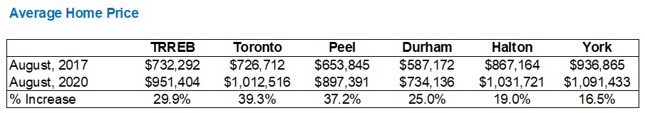
During this time period, York Region appreciated (on paper, at least), at less than half the rate of Peel Region, and substantially less than the City of Toronto.
Like I said: on paper.
But what about the Scarborough condo in Toronto-416 versus the detached new-build in York Region? Would the rates of appreciation come out the same?
And what about the peaks and valleys, and differences that, say, one month can bring?
Let’s re-run this again using September of 2017, and see how the rates of appreciation change:
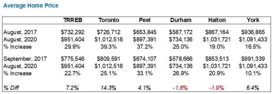
Look at the difference that one month can make.
Two of the three areas actually saw the average home price decrease in September, which is traditionally a far busier and far more lucrative month than August. As a result, the rate of appreciation in York Region goes from being a little more than half of that of Peel Region, to a little less than a quarter.
Can all that change in a month?
Not really. But it’s what the numbers are showing.
Did the person who purchased a house in Toronto-416 in August of 2017 experience a 39.3% appreciation, whereas the buyer of the identical house next door, who bought in September of 2017, only experienced a 25.1% appreciation?
Of course not.
But each and every month, the headlines that we read in the major newspapers, or the BlogTO’s and Toronto Storeys’ of the world, not to mention thousands of real estate agents’ social media, will all tell only part of the market tale.
If you want to show the market in an incredible light, use the year-over-year average Toronto sale price, which was up 20.1% in August.
If you want to show the market in a cautionary state, talk about the massive 56.8% increase in new listings, year-over-year.
If you want to show the market was poor in August, then highlight the average sale price of “The Holy Grail of Real Estate,” ie. the coveted detached house in the 416, falling from $1,541,003 in July to merely $1,505,100 in August.
There are many ways to skin a cat, as the saying goes. But who in the hell skins a cat? That’s some psycho shit. Do we really use this phrase in front of our children?
Now that I have answered the second part, of question number-three, first, let me get to, well, the first…
What’s going to happen to the average home price in September?
Take a look at this, and you let me know:
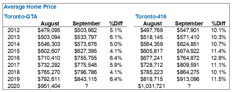
Two things I guarantee will not happen this fall:
1) The GTA average home price will not increase by 5.4% in September.
2) The 416 average home price will not increase by 11.0% in September.
So much for historical indicators, right?
The run-up in average pricing this summer is unprecedented, and I’m not using that word in the prototypical exaggerated way.
Look:

The pandemic changed everything, folks.
The way we use real estate statistics is going to be thrown out the window for the rest of the year, at least, and that starts with average home price.
–
Well, I’m two-for-two in going up against my word count limit here to start the Fall of 2020.
While I recognize that some of you enjoy 3,000-word blog posts to start your morning, others don’t. And most don’t like 6,000 words…
So I’ll pick this up on Monday with my final two questions, and who knows, I may have a third for good measure…


Appraiser
at 8:15 am
Welcome David Fleming.
CREA and TRREB have been trying to explain the HPI to the public for a decade.
Most journalists and analysts have stubbornly stuck to reporting averages. Remember, news is written at a grade 8 level. Incidentally, median house prices also suffer from some of the same statistical maladies as averages.
HPI is not perfect. (…”few models are, but some are useful”). But it is by far the best, thus far.
OMG David, what’s next – coming on board with us MMT advocates? 🙂
Geoffrey
at 5:39 pm
well… news is written at a grade 8 level because the audience is at a grade 8 level, not because the reporters are…
Appraiser
at 8:48 am
Speaking of statistics.
Interesting twitter exchange between LG and Ben Myers regarding the efficacy of the price / rent ratio and the definition of perfect substitutes.
John Pasalis: “But what’s interesting about Toronto’s condo market is that they are actually perfect substitutes. Condo prices are rising while condo rents (in the exact same locations and buildings) are falling.”
Ben Myers: “You’d still have to control for unit size, as the average condo rental is typically about 100 sf smaller than the average ownership unit traded. But there is fundamental disconnect between the two. The other factor worth considering is that baked into the price someone is willing to pay for something is their expectation of future price growth and expected utility. Owning a condo allows you to renovate at your will, most landlords wouldn’t allow that.
…Secondly, most rented condos have not security of tenure, the owner can sell the unit out from under you at any time. Therefore, there is an inherent premium you’d pay to own vs rent the same unit. That ownership premium may be even higher in a building without rent control.” https://twitter.com/benmyers29?ref_src=twsrc%5Egoogle%7Ctwcamp%5Eserp%7Ctwgr%5Eauthor
Which one sounds like the most experienced and knowledgeable real estate analyst?
Kyle
at 9:33 am
John seems to have some memory issues, both rent and condo prices have risen in unison for the majority of the last decade or longer. It’s only been since this year that rents have begun to decrease, while condo prices continued to increase. Softening rents obviously have much more to do with Covid factors, STR rules then they do with people switching from renting to buying.
Bal
at 12:46 pm
I did try to read the blog but lost in all the details..lol….so in simple English…. the market will be going downhill from here?? Or I am misleading….lol….
Thomas
at 7:32 am
Lol!
Verbal Kint
at 9:53 am
Funny how somebody can be the public face of a huge mortgage fraud and still be quoted as a reliable commentator.
Appraiser
at 5:47 am
Funnier still is how some people can’t distinguish the signal from the noise.
Wahed Fidaali
at 11:46 pm
Hi David, does the TREB data you are using for new listings and sales include pre-construction condo sales, or is this data only for the re-sale market?
Wondering whether pre construction sales have an inflationary affect on the data, as pre construction prices seem to be through the roof?
Natrx
at 2:26 pm
Come the dead of winter, when many are sick, no more patios, listings still on the market, I have a hard time believing things will stay as is. Feels like the ship is taking on a lot of water. And if freehold homes are such a sure thing, why not just flip and flip?
Appraiser
at 5:57 am
“Ship taking on water.” How ominous. You bears are so scary.
Reality update: TRREB sales for first 10 days of September 2020 v. 2019
Freeholds 2,973 v. 1,888 +36%
Condos 945 v. 870 +8%
Jonathan C
at 4:15 pm
I see the downtown condo market continuing to soften into this winter, even if fears of COVID subside. Why? Thousands of young adults have packed up and gone back home to mom and dad’s house for the foreseeable future. Universities are mostly online for this semester and possibly next, and all major downtown employers are encouraging remote work at least until January 2021, in some cases until next summer.
The low-rise market won’t be affected since relatively few are actually selling and moving out of the city, but any landlords who had students move out in the spring and haven’t found replacements tenants are basically screwed at this point. I wouldn’t be surprised if we saw even more condo inventory come on the market from owners who can’t stomach the vacancy or rent cuts.
I do think the condo market will start to recover mid next year as these people come back to the city, so there may be a buying opportunity at some point
Thomas
at 5:55 pm
It is likely going to take longer than another year for things to get back to normal. Many employers have already declared work from home until mid of next year. They will most likely extend it.
Geoffrey
at 5:41 pm
I agree. Especially if the school year/daycare is closed down again, game over until September 2021 at the earliest.