
A few months ago, I was working with a young couple who were looking to buy their first home in Toronto. Like most internet memes would suggest, these “entry-level” buyers were, of course, looking around the $1.6M mark…
They were cool. Way cooler than me.
She worked in fashion, so right away I knew that she would have unique tastes, and I figured that if he showed up in a hoodie, it was probably a designer hoodie by Jean-Claude Van Nomme De Guerre, or another appropriately-named, fashionable individual that I have never heard of.
What I found so entertaining and refreshing was that they didn’t like all those things that other buyers liked, and that they loved anything different.
I suppose that’s because they’re just way ahead of the fashion curve, and that anything that the masses like, they liked a long time ago, before it was common.
So when I showed them this house on the east side that had some bizarre features, I figured, “These guys will probably like it!”
Case in point, this main floor powder room:
To you and I, that’s whack, right?
I mean, it’s borderline-insane.
For most of my clients, I’d get out ahead of this and say, “Hey, the house is really awesome, but, ya know, there’s a few things you might wanna change…”
But when we walked into this house, I said, “The bathroom’s really weird. You’re going to love it.”
And you know what?
She said, “OH MY GOD I LOVE IT!”
Man, I’m so boring. Just sitting here in my Banana Republic t-shirt and socks that I bought on Amazon, ready to go home to my house with off-white walls….
(sigh)
In my next life, I will be into fashion. And cars. And nice restaurants.
But for now, let me show you some more “out there” bathroom wallpaper and design elements, and you let me know what you think.
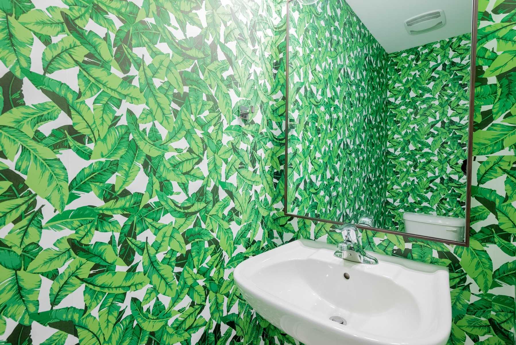
First and foremost, what do you think if the rainforest above? Yay or nay?
–
Alright then, what about this one:

Crazy, right?
Maybe.
But this bathroom wallpaper is in a house that recently got sixteen offers and sold for 138% of list, so maybe it’s not so crazy after all.
Not exactly my thing, but maybe my thing isn’t “in.”
–
How about this swirly-whirly pattern:
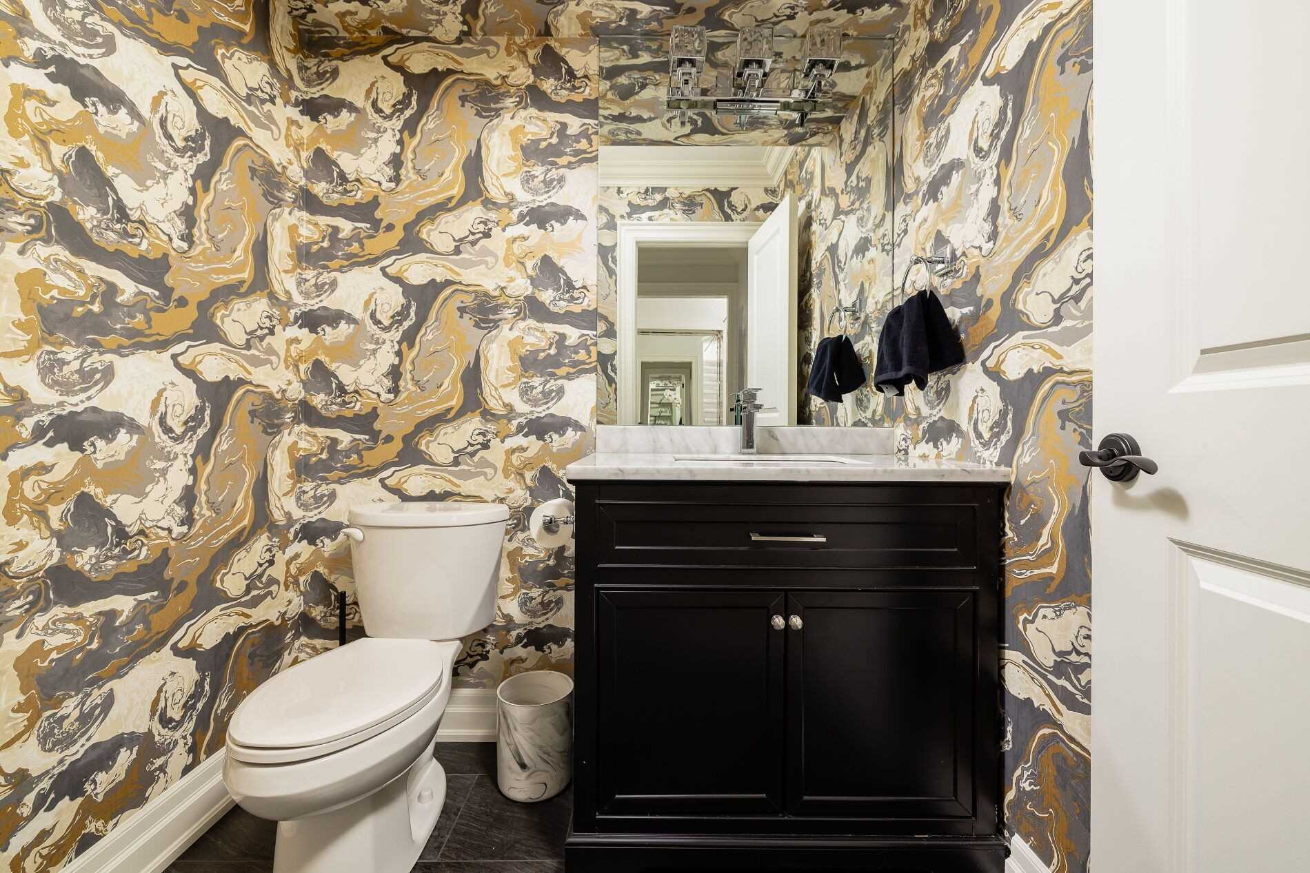
Is it possible that those of us who don’t immediately like this just have no taste?
After all, this is a powder room in a $2.55M house!
–
This one is less “out there” but I actually think that makes me like it less.
I’m sort of thinking, “If you’re gonna go crazy, go nuts,” like the rainforest or the wild colours above.
This one is almost ugly because it’s not ugly enough:

–
The next one is merely one small, narrow wall in a powder room, but does that make it easier to swallow:

That’s a semi-detached house on the east side, fully renovated with the words “thoughtfully designed” in the MLS listing.
–
I’m sort of getting my groove here, so tell me if I’m right on this one: the brown feature walls clash with the whack-a-doodle tropical wallpaper:

Are those beetles? Ladybugs or something?
I feel like if you had a dinner party and everybody took acid, your guests would see some really special things in that bathroom…
–
This next one is just a “tease” of the bathroom wallpaper since the listing didn’t have the full wall, but as whacky as that wallpaper is, I have a feeling I’d like it:

–
Again, I think this is almost too tame for me, now that I’ve lived in the wild with the wallpapers atop this list:

–
Here’s an attempt to make the old, ugly wall-tile look less old and ugly.
But I don’t know that adding the bright blue (and ugly…) wallpaper helped at all:

–
This wallpaper looks like it’s in an old house, but this is actually a new house, made to look old.

Does that make any sense?
–
This is wallpaper made to look like fake brick:

Like it, or love it?
You only have two options…
–
How about some shower tiles and backsplashes, shall we?
This looks like a basement bathroom (hence the washer/dryer…), and while I wouldn’t personally choose that backsplash, I suppose it could work:

I just think it doesn’t work with the baby-blue vanity, and the farmhouse sink, and the wooden countertop.
Just way, way too much going on in that bathroom.
–
I feel like this belongs in many, many design magazines, and yet very few people would actually like it:

–
Mosaics can work, but you have to be careful…

I don’t love the porcelain shower tiles playing off this mosaic floor and wall.
But maybe that’s just me…
–
Just because they put a photo of a blue sky above the toilet, doesn’t make this bathroom shower tile “work”

–
You know when you’ve had like 5-6 pieces of pizza, and it’s delicious, but you reach for that one extra piece?
You can get away with that. Sometimes.
But when you pile two more into your mouth, you regret it.
I think that’s the analogy for this bathroom:

–
Less is more here, but I still feel it’s too much…

–
This metal bucket for a sink almost makes that backsplash tolerable:

Almost…
–
And last, but certainly not least, if you want to hand-draw in the bathroom to add some character and authenticity, don’t feel like you need to stop at the walls. After all, the ceiling is a kinda-sorta wall too…

I really, really don’t want to know what’s in that bucket…
Happy Friday, folks!


Andrew
at 9:13 am
Server down this morning, David? First time I’ve ever seen that.
Sunil Adalja
at 9:16 am
ha! the floral wall paper on the house that sold this week for 138% — i actually liked it and in fact showed it to my wife and 14 yr old — both of them looked at me as if i had gone off my rocker!
Joel
at 10:53 am
I saw this one in person and the jelly fish wallpaper worked in real life.https://themash.ca/realestategossip/2021/3/261-kingswood-road-beaches-toronto
Izzy Bedibida
at 1:23 pm
Cool. Lots of very interesting design themes. I’ll have to share it with my gr 9 next week. We’re starting an architectural design project
R
at 10:18 pm
Stick to baseball cards and leave interior design to people with style
David Fleming
at 2:26 pm
@ R
Hockey cards. Don’t pretend like you don’t know…
cyber
at 8:17 pm
Like the all-black bathroom the most – cohesive design, high end finishes, also easiest to keep it looking clean as lighting also looks understated.
‘Watercolour painting’ one with the purple towel is also unique and fun, the all-over wallpaper gives it a “jewel box” feeling that can work well for a small bathroom – which this one is based on reflection of the window in the mirror.
The “tease” one is also nice, not really my style but has a cohesive “high end hotel” look.
The rest seem like a mish-mash of random statement wall, or – even worse – random Pinterest trends put together in a way that’s incoherent and/or too much. Sort of like if a house flipper tried to make something look better either quickly, or in a design style they think is high end but is several years behind the times (or was never “in” in the first place).
Marty
at 1:21 pm
I like 95% of them.