
There’s a reason I wrote last Monday’s blog, and no, it wasn’t “to get out ahead of the bad publicity.”
“Beware The Coming Real Estate Headlines,” I wrote on May 2nd, and if you’d like to be fair to me for just a moment, you can admit that I wasn’t exactly wrong.
Here’s my Google News feed from Wednesday:

Down
Falling
Plunge
Dip
Plunge
Cool
Drop
Slam
Dip
Downturn
Those are the words used in the five headlines above.
And of the five headlines, four deal with sales instead of price.
As I wrote last week, the mind sees what it wants to see.
“PLUNGE”……………………”FORTY PERCENT”
The mind draws its own conclusions.
But what if, just for argument’s sake, sales plunged 40% but in the same period, prices went up by 5%? What then? What do we report in the media? What do the headlines look like?
Folks, the TRREB stats from April will show that the market has softened. This should come as no surprise to anybody out there who follows the market at all.
However, as I predicted last week, the headlines are going to be distorted in an effort to capture the attention of people who are being inundated with stimulae every minute of every day.
One commenter pointed out last week that when the market is hot, the headlines are exaggerated as well. Another reader said that real estate agents benefit from the media attention in bullish periods, and he’s not wrong.
I’m not denying any of that, nor will I deny weakness in the market when I analyze today’s stats.
I just want to remain focused on the overall picture, while looking at individual market segments, based on price, property type, and geography, to show that you can’t paint the entire market with one brush.
An example, perhaps?
Through April of 2022, no semi-detached, 3-bedroom, 2-bathroom house in Leaside had ever sold for more than $2,000,000.
Never. Not once. It was a barrier that had never been broken.
Despite the “weakness in the market,” and the headlines using words like “plunging,” this magically happened last week:

Thanks to TRREB’s archaic rules about “disseminating sold data,” I have to blackout the address. But you can find this by using any of the apps that are better than TRREB could ever produce, so go for it…
Now, Leaside’s cousin is Davisville Village, located on the flip-side of Bayview Avenue.
Just like Leaside, no semi-detached, 3-bedroom, 2-bathroom house had ever broken the $2,000,000 barrier.
Then along came this pretty-little-ditty on a popular street, and guess what happened?
This:

Another new record, eh?
Is the market really that bad?
Don’t worry, we’ll get to Durham Region in a moment.
But first, let’s look at what happened only one week after the first sale, on the same street, for a similar home:

“Oh no, you d – ‘int!”
Yaas, guy!
How’s a 5% increase inside a week? And sure, there are differences in the two houses, but the point here is that the first sale wasn’t an outlier, but rather a new floor in a market that is apparently “plunging.”
Now, speaking of plunging.
Can we talk about some of the areas outside the central core?
I’ve heard horror stories about how 50% of all listings in Durham Region are re-listings, and one such property was brought to my attention by a team member who lives out that way.
Here’s a house they’re watching:
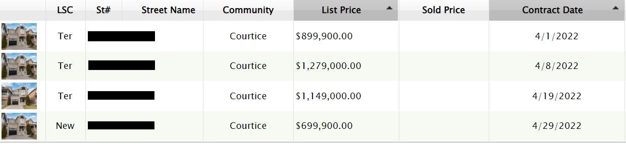
This property was listed for $899,900 on April 1st, with an offer date.
They were probably looking for something in the high-$1.2M range, and figured that they just needed to get five, six, or a dozen offers on the house and the market would organically take the price up $350,000 above list.
But that didn’t work. Whether they received zero offers or ten offers, they didn’t get “their price.”
So they re-listed on April 8th for $1,279,000.
That didn’t work.
So they re-listed for $1,149,000 on April 19th; an effective “price drop” of $130,000.
But that didn’t work either!
So now they’ve gone nuclear. They’ve listed for $699,900, with an offer date.
And what do you think is going to happen here?
Are buyers going to show up like sheep to a wolf’s den, covered in honey, and asking, “May we please submit an offer on your home?”
I doubt it.
These sellers clearly want $1.1 Million for the house, and while buyers (likely?) aren’t stupid enough to think that the property could sell for $699,900, I wonder if there’s anybody out there who’s going to “bid” $400,000 over the list price, given the history of this listing, the obvious desperation of the seller, and the overall optics of the market?
So what in the world is happening in the market right now?
Well, perhaps a refresher on the GTA average home price, which dropped by 3.5% last month:
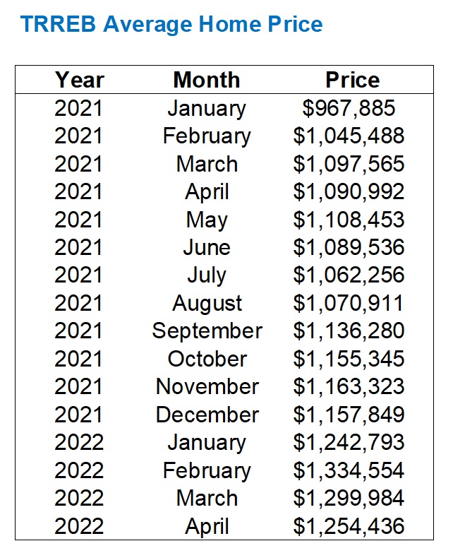
The average home price dropped by 3.5% last month, from $1,299,984 in March to $1,254,436 in April.
That’s on the heels of a 2.6% drop in average home price from February to March, aka “the peak” to last month.
There are two ways of looking at this:
1) Average home price is down 6.0% from February to April.
2) Average home price is up 8.3% from December to April.
The sky is not falling, folks.
Hardly.
The April average home price was higher than January, and we’re not exactly day-trading real estate, right?
What’s more is that in my blog posts and eNewsletters, I predicted both of these drops, from February to March and March to April. This isn’t rocket science. The average home price increased 7.6% and 7.7%, month-over-month, to start the year. We weren’t going to see the average home price hit $1.5M in June.
But as I alluded to in today’s introduction, we’re seeing records set in some areas, while other neighbourhoods languish.
What does the TRREB average home price look like if we break it down by district?
Oh, it tells a story:
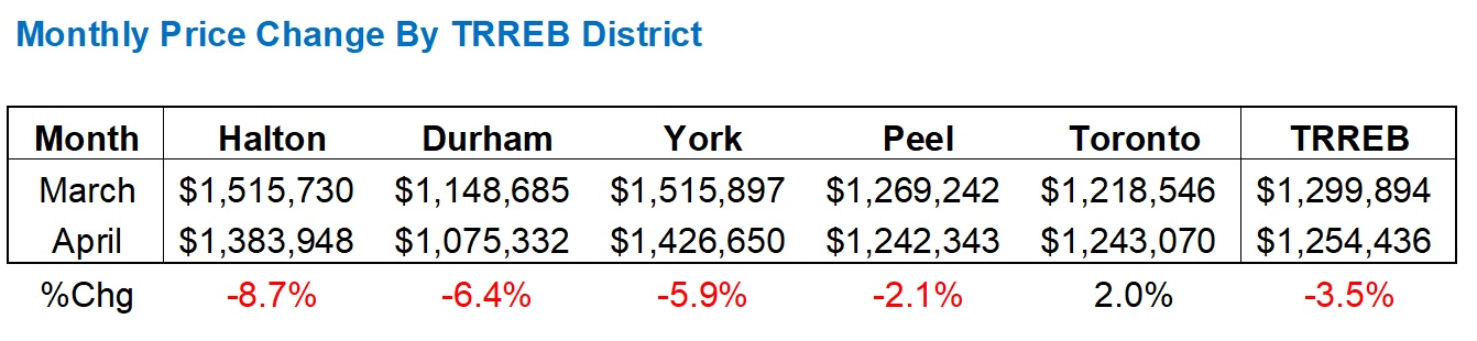
Does anybody really think their house in Halton is worth 8.7% less on April 30th than it was on March 30th?
Doubtful.
But the numbers are the numbers, and this is what the data is telling us.
As explained via the Leaside and Davisville examples above, some areas of GTA remain hot, while some neighbourhoods in the central core are scorching and setting records.
That 3.5% decline in GTA prices includes a 2.0% increase in the 416, which you won’t find reported in a single media outlet this week.
If you want to take the figures back even further, say to January, Durham leaps ahead of Halton but the story is the same:

Toronto is up 15.8% since January, but every other district is down.
And the TRREB average is up a modest 0.9%, which is obviously carried by Toronto.
So how did this happen?
The irony is: it’s because we saw massive price increases in one of the most unlikely months of the year: January.
Take this chart back one more month, and this is how April prices compared to December of last year:
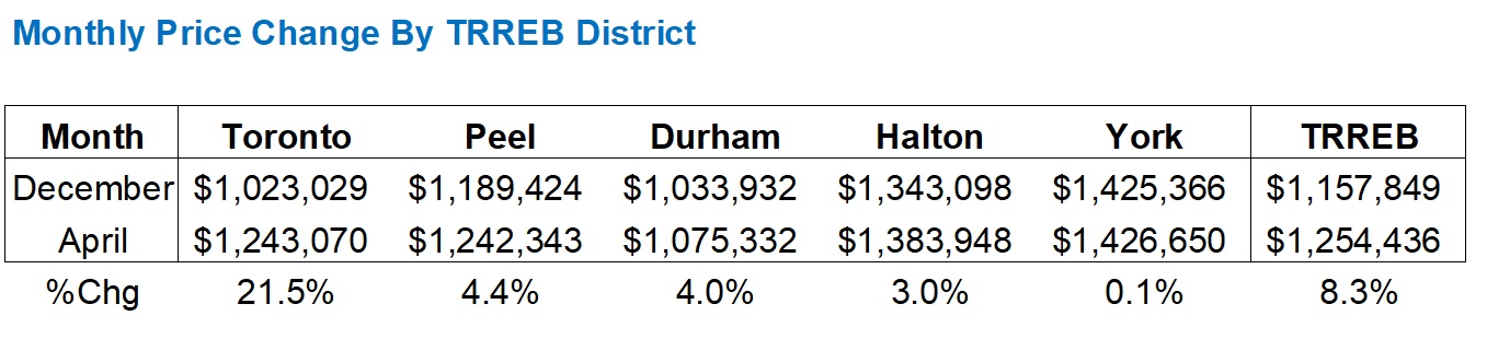
I’m working top-down now, as you can see.
Toronto is well ahead of the other TRREB districts but they’re all still in black figures.
So essentially, prices increased so dramatically in the suburbs in the month of January but have now come back to earth in the past couple months.
Meanwhile, the city of Toronto just keeps on ticking.
When we look at sales and new listings, that’s where we could really tell a good number of stories, if we wanted to. Let’s try to look at each individually and then make sense of the absorption rate.
There were 8,008 sales in the GTA in April.
This is down a whopping 41.2% from April of 2021.
But April of 2021 was the all-time high for the month of April, so is that a fair comparison?
No.
But were the 8,008 sales this past month “normal” in any way, shape, or form?
No.
Look at this:
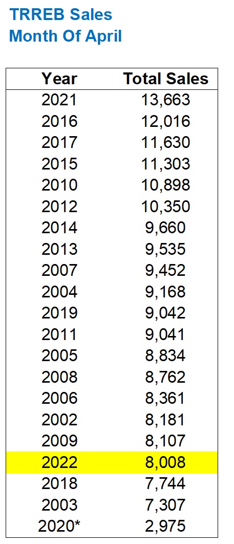
Excluding the pandemic-ridden year of 2020, this past April was the third-lowest sales total since we started tracking data in 2002.
What does that mean?
And is this a 2022 problem, or is it an April problem?
Not if we look back at the month of March:

From the third-highest in March to the third-lowest in April.
It looks like the month of April was either an outlier or a turning point, and if we break down the sales-to-new-listings ratio by district, we’ll see where and why:

Look at the overall TRREB sales-to-new-listings ratio.
What started as a “tight” market in January with a 71% SNLR has dropped each and every month since.
While this is normal, and we see a lower SLNR in the spring than in the winter, I think once we start to see SNLR’s in the 30% range, we know it’s turning toward a buyer’s market.
Peel Region currently shows a 39% SNLR.
York Region currently shows a 38% SNLR.
And while Durham Region shows, amazingly, an SNLR of 47%, the example of the listing I showed you above in Courtice, Ontario demonstrates how much tougher it is for sellers to sell.
Of course, that listing in Courtice above also shows you how ONE house was listed FOUR times, and that counts as four “new listings,” so the data will always be a little skewed.
But the trend is down, and if we were to place the above data right next to the same data for each district in 2021, we’ll really see how the market has changed:

Look at Halton Region, just as an example.
In 2021, we saw SNLR go from 75% to 72% to 73% to 71%.
In 2022, we saw SNLR go from 73% to 66% to 55% to 43%.
Is it any wonder why prices have trailed off?
The only thing in the data set that doesn’t make sense is with respect to the City of Toronto, since the SNLR follows a similar pattern, and yet prices are rising.
Some might say, “Toronto will just take longer to decline.”
Others will argue, “Toronto is resilient.”
Pick your poison, and I could argue the first point by looking at the data, and I could argue the second point by looking at what’s happening in the market.
Now, why is this happening in April of 2022? Why now? And how did we get here?
If we look at the average price, pre-pandemic, and trace that through the end of 2021, I think it speaks volumes:

‘Nuff said, right?
2022 starts with a bang overall, but February “peaks” in the GTA overall, and most of that is due to absurd strength in the City of Toronto.
Conclusions, anybody?
Well, if I’m looking at this market with one-part “gut” and one-part “objective statistical analysis,” I would conclude the following:
1) The party is over in the suburbs.
Prices have retreated and for good reason. The 58% increase in average home price in Durham Region in 23 months wasn’t sustainable, and although prices have and will retreat, the gains are still significant. Real estate in the suburbs was too cheap for too long, and although the market eventually became oversold, that catching-up in price is real as most of the gains will remain.
2) The decline in sales is real.
Nobody can argue a statistical anomaly here. It’s not just the suburbs. It’s not just freehold. It’s across the board. Perhaps the interest rate hike put fear into people, but whether or not this drop in sales remains in May and into June has yet to be determined.
3) Inventory isn’t “peaking.”
It’s very, very interesting to see new listings actually decline on a month-over-month basis. And keep in mind, yet again, this point can’t be finessed with statistics either. New listings were down GTA-wide, but also down in each of Halton, Peel, Durham, York, and Toronto. Across the board, new listings are down, which nobody would have predicted.
4) The 416 is holding strong.
I know there are some people hoping/waiting/wishing for a similar decline in prices, but for now, we’ve seen two straight months where the GTA average home price declined, and the 416 average home price increased. I would expect a pull-back in May. A modest one, but I don’t see another increase.
–
April showers bring May flowers.
So how does this idiom apply to the real estate market?


Bal
at 6:58 am
Even though I bought the house but as i mentioned always….House prices are always directly impacted only and only by interest rates…..If interest rates keep going up….Prices will keep coming down….simple math….The reason of Toronto (416)prices are holding up because Toronto did not increase the way other areas increase in last two years. Furthermore people are started going back to work…
JF007
at 8:00 am
Don’t think it is as simple a correlation…what about inventory..sentiments..immigration..demand for a certain housing type etc etc…lot of parameters to be considered beside interest rate…David can we also see a breakdown of charts by housing type..also would be interesting to correlate the data to immigration levels..not sure how many know but Canada hasn’t let skilled workers in as permanent residents since pandemic and is about to restart that program..and why I say this could be a factor is because lot of immigrants who I know came before pandemic and found decent paying jobs were very active across GTA in the past year..so if skilled program restarts in large numbers then it is to be argued that within a year they are likely to be active buyers as well..
Bal
at 10:32 am
lol…why Inventory is high because interest rates are up…why Sentiments are down because interest rates are up……
JF007
at 10:55 am
but is inventory really up..per TREB data April inventory is actually down approx 12% YOY..so clearly that correlation of yours doesn’t work at least based on what TREB posted..
Dusty
at 4:41 pm
Decent paying jobs is one thing, but from my experience in the Toronto tech industry working with recent immigrants that are in high demand and command high wages, I would say most of them are not in a position to buy right away. It’s a 3 to 5 year wait until they have the work experience a bank will recognize, even if they’re making 150 to 180k a year, right off the boat. Plus, they don’t generally land in Canada with a hefty down payment. They get there quickly given their wages, but it takes a few years.
Appraiser
at 8:41 am
The 41% plunge narrative was definitely the money shot last week. Media headline porn.
Thanks once again for excellent data and a realistic point of view.
True… but somehow limp and therefore not headline worthy.
Average Joe
at 1:55 pm
https://www.theglobeandmail.com/business/article-blackstone-targets-canadian-real-estate-opens-office-in-toronto/
Interesting timing. Ontario market starts to show cracks and suddenly America’s most notorious landlord shows up. Invitation Homes got big buying foreclosures after the financial crisis, not by winning bidding wars. I’m curious what these folks are up to.
Alexander
at 2:20 pm
I can see some high prices paid after only a few days on the market, but there are more and more properties simply waiting for an offer. Whether it is buyers waiting for unreasonably high ones or there is none – hard to judge. It will take time, higher CPI numbers and additional interest rate increases, but prices are certainly going down in the medium term. The sky is not falling down YET. And those who certainly overpaid for a semi in Leaside are going to regret it.
JF007
at 3:15 pm
Agree..there are a few properties in my neighborhood that have been on the mkt for last 2-3 weeks now in hopes of achieving late Feb/early March prices..have listed up and down already few times to no avail..having said that out of the 7-8 i track only 2 of them were purchased in 2020 rest are either on the mkt first time or were last in mkt at just half the price of what folks are trying to sell them for now..so will be interesting to see if these folks who probably are hoping to make 600-700K on what they purchased it last will take a hair cut or just chose to lease the property out..cuz if later is the case and is a trend going fwd then prices might not come down as much as some hope them to be.
cyber
at 6:29 pm
I do wander, especially in SFH segment, whether Toronto seems more resilient because more significant portion of owners are older, more likely to be retired, and in no rush to move or “cash out”. They can be lured to list by agents pointing to comps and promising certain price, but just as easily take property off the market, wait out another year or two to get “their” now expected price / cap gain, in the meantime taking out more equity if / when needed because they bought in so long ago there’s plenty remaining.
JF007
at 8:06 pm
Definitely another dimension added to the mix
Jennifer
at 12:30 pm
same in my area…but also some still off the charts stupid.
Daniel
at 8:18 am
David can we get more examples like the house in Courtice? I’ve heard this is happening everywhere. Like every second house. Confirm or deny?
David Fleming
at 10:41 am
@ Daniel
Challenge accepted.
Somewhat.
I’ll do a post on all the different types of sales – re-lists, up-and-down in price, failed offer nights, pricing with “offers any time” even though sellers won’t take that price, etc.
Good topic for tomorrow.
My son is sick and I have to take a shift at home while he naps this afternoon so I’ll have three hours (hopefully three…) in front of the computer in the home office. Should be able to bang this one out in that time.
Thx!